Brine Squarespace Template Analysis
Helpful notes on the distinctive features of the Brine family of templates
Updated March 2018, now with extra info about this very special template family
Template Name: Brine family
Includes: Aria, Basil, Blend, Brine, Burke, Cacao, Clay, Ethan, Fairfield, Feed, Foster, Greenwich, Hatch, Heights, Hunter, Hyde, Impact, Jaunt, Juke, Keene, Kin, Lincoln(discontinued), Maple, Margot, Marta, Mentor, Mercer, Miller, Mojave, Moksha, Motto, Nueva, Pedro, Polaris, Pursuit, Rally, Rover, Royce, Sofia, Sonny, Sonora, Stella, Thorne, Vow, Wav, West
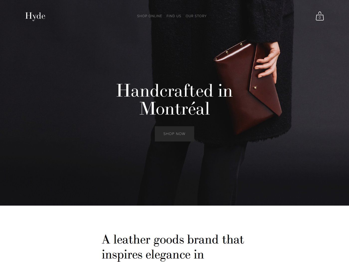
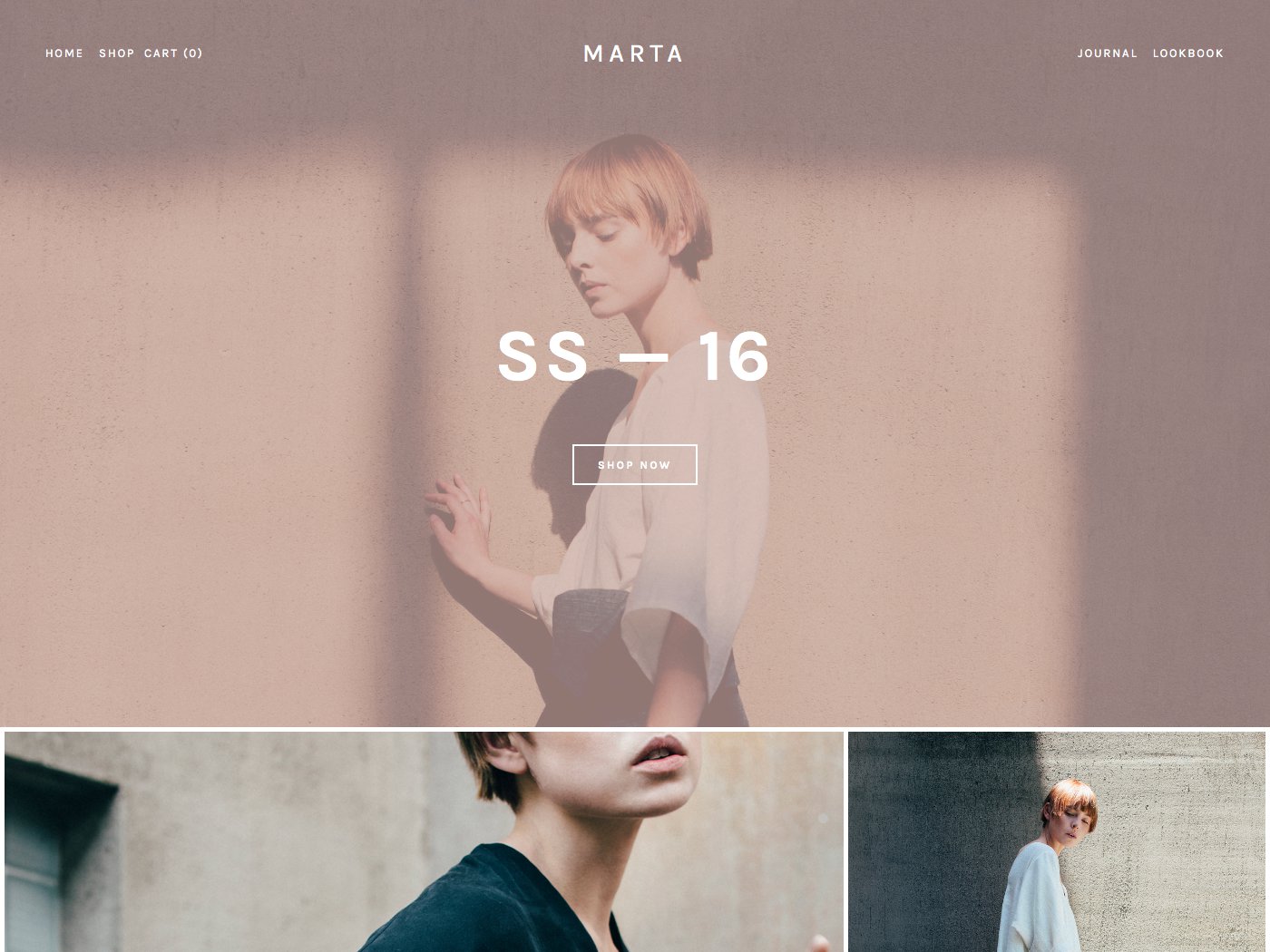
Brine is one of the newest types of Squarespace templates, released in November 2015. This new breed of template has a greater level of control than the older templates, many of which were developed in 2012-13. Brine was released alongside three templates released at this time (Thorne, Hyde and Marta) that were identical in terms of the controls and features available, making Brine the first of the templates created to be a flexible framework, rather than a unique one-off template. This was later named the Brine template family, which has since grown to include more than 30 templates.
Why choose the Brine family?
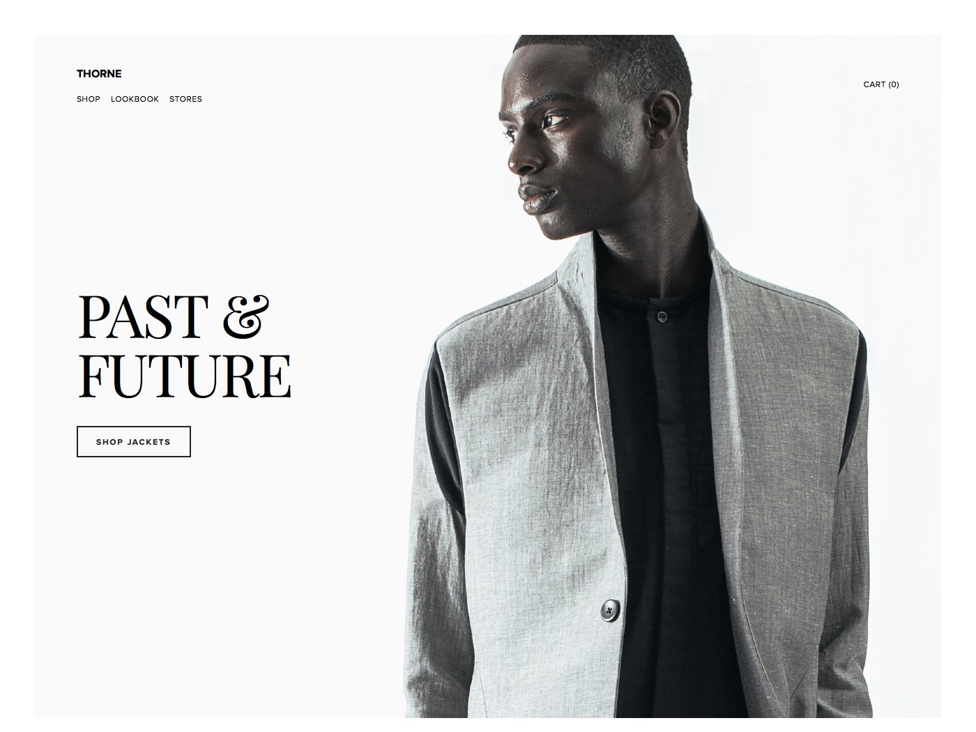
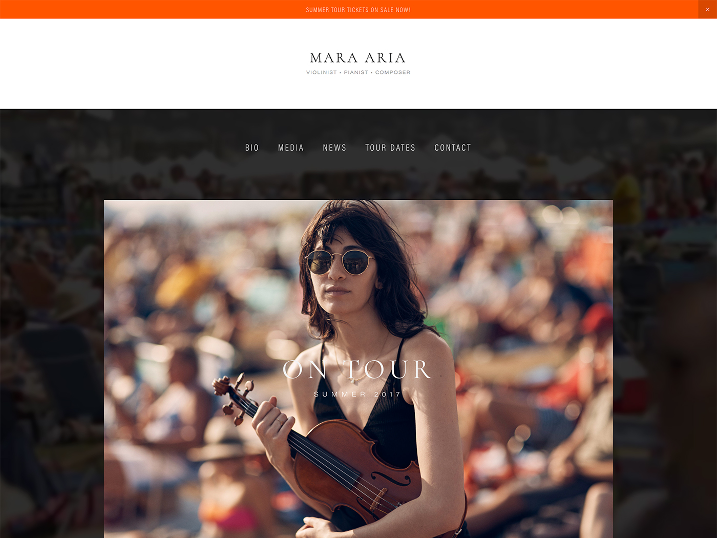
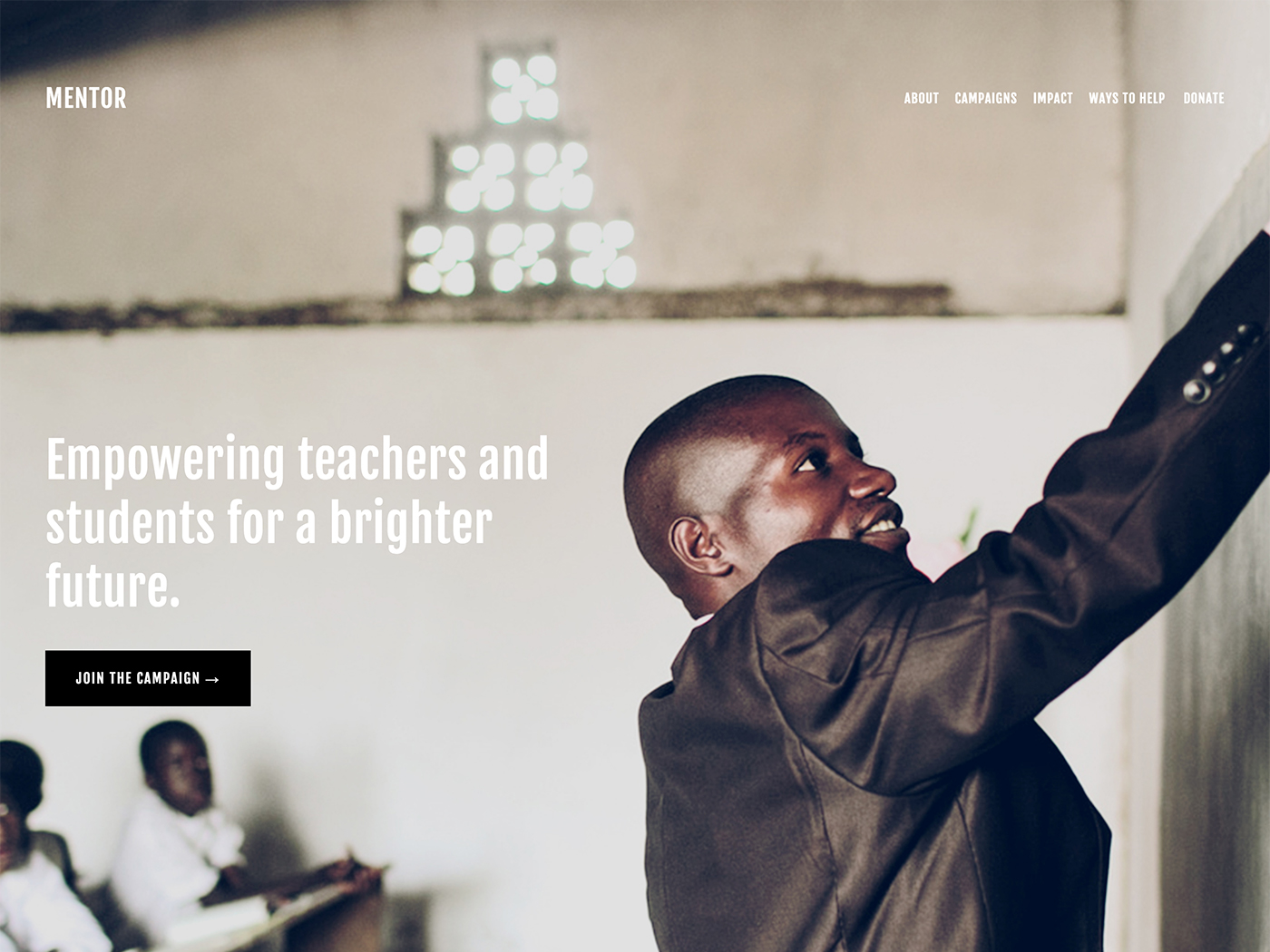
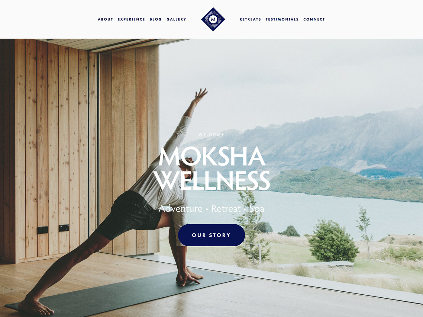
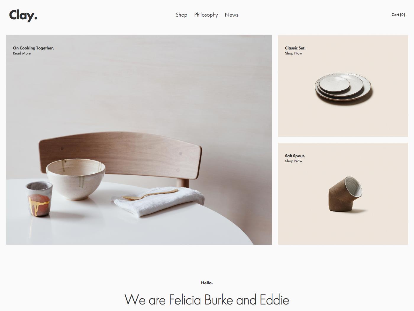
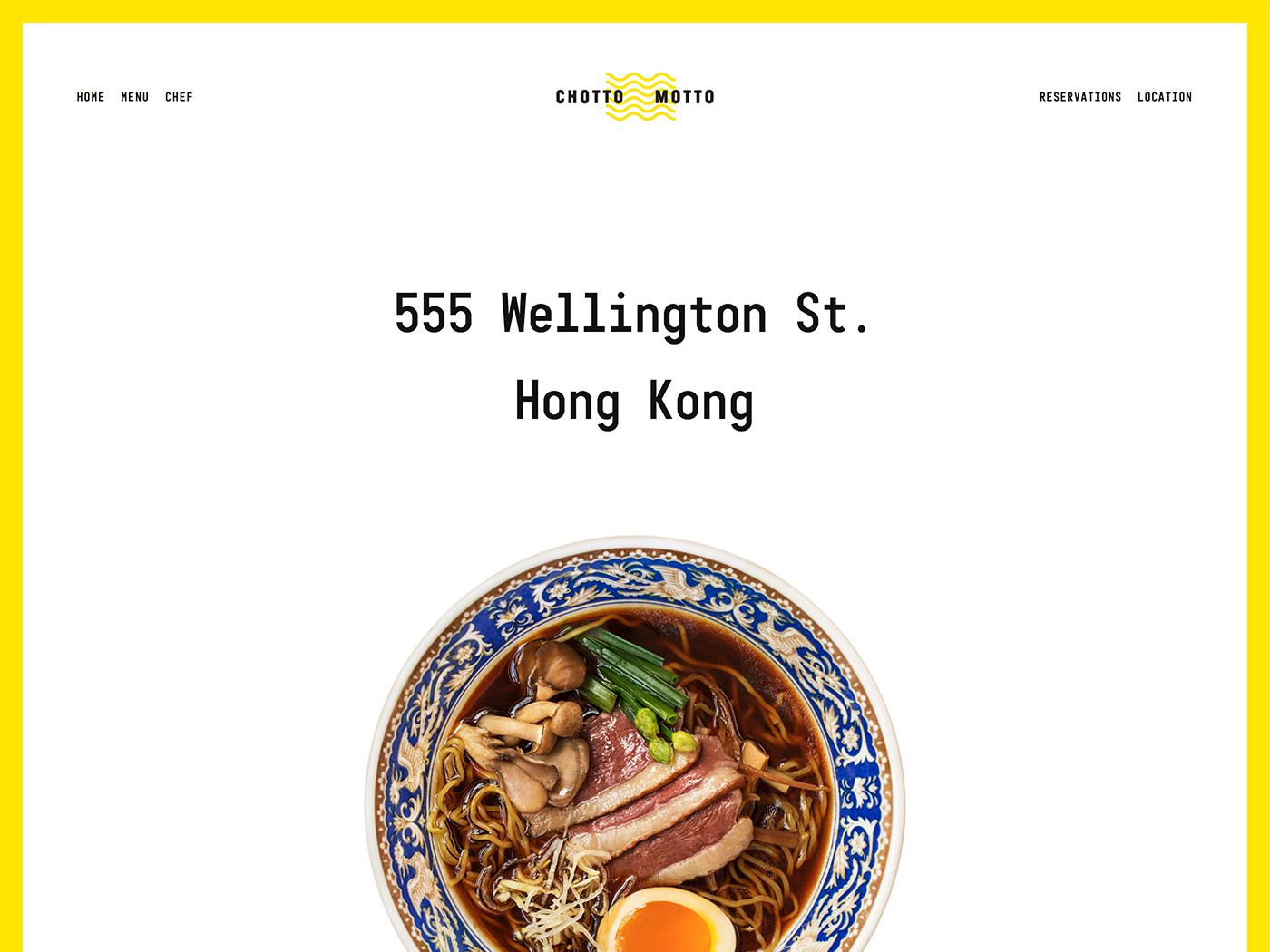
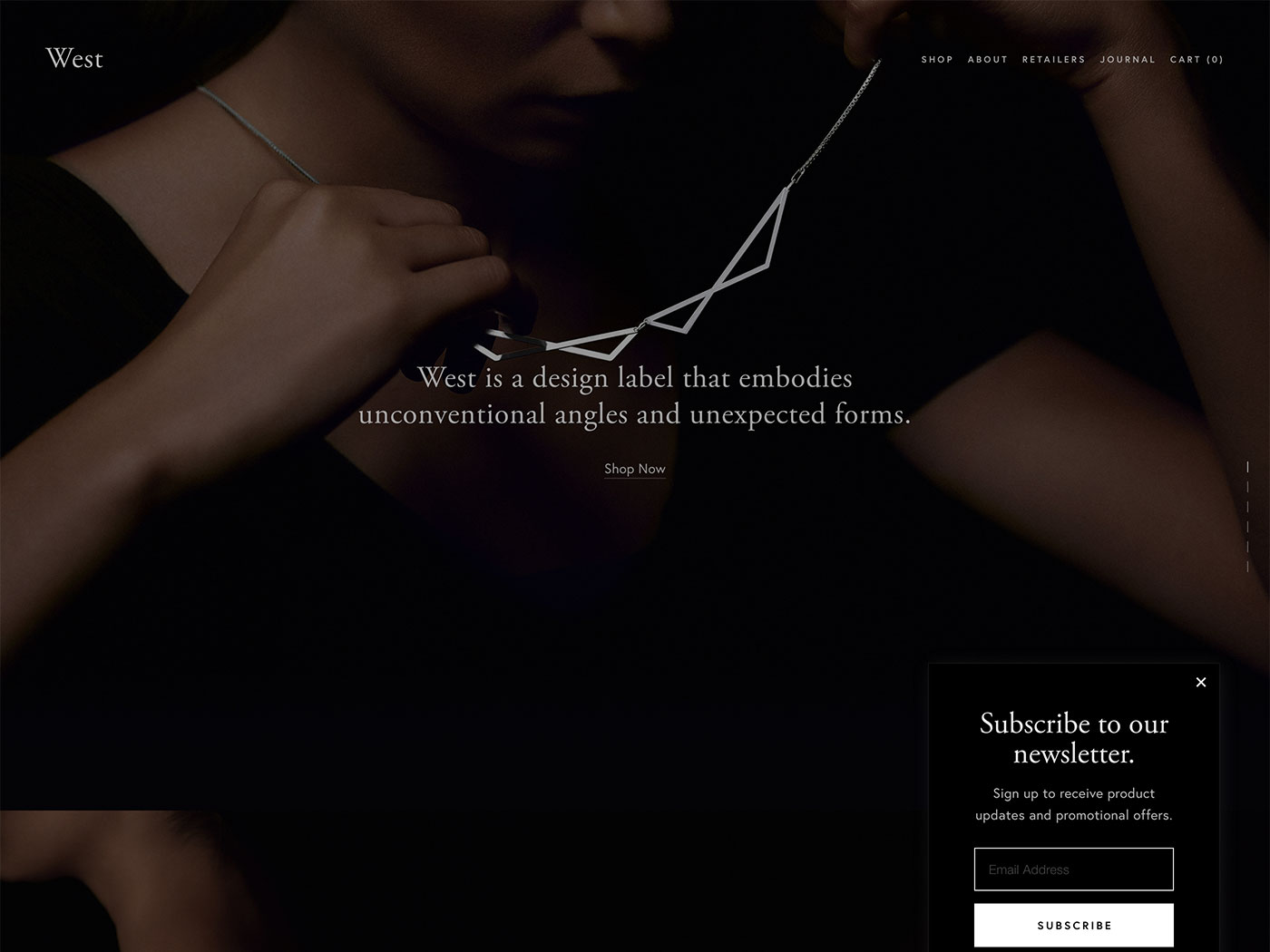
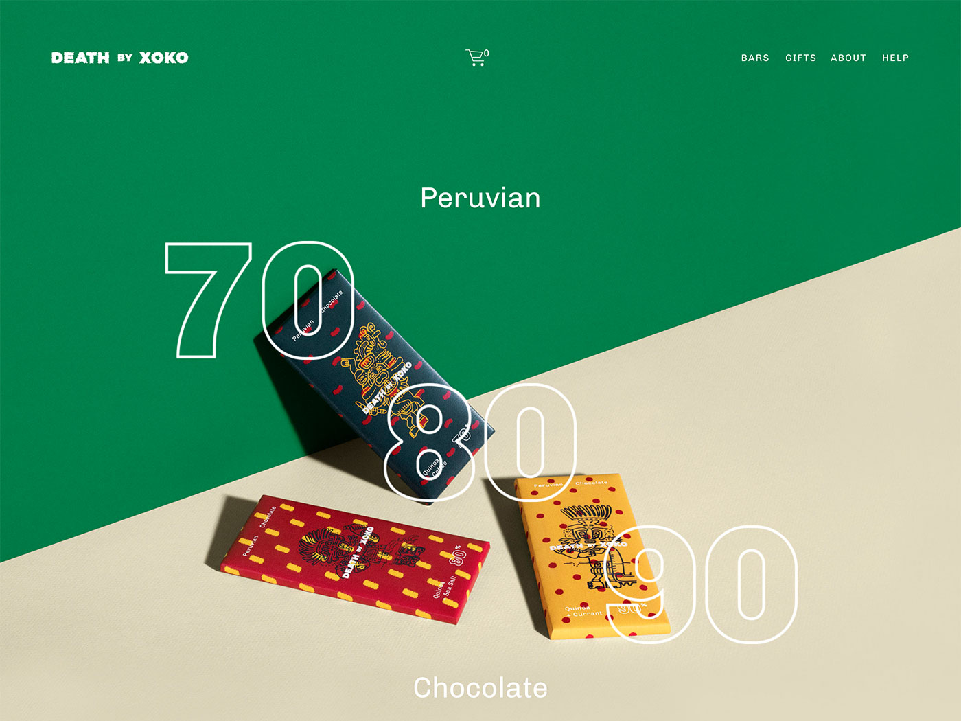
As the Brine family is a flexible framework, it means that things like the position of the logo, navigation, social icons, shopping cart icon and many other elements can be moved around. Just have a look at the slideshow on this page to see what I mean - notice things like the logo location, use of buttons or search within the navigation, border around the page, and more. All of these can be set and adjusted within the Style Editor, making Brine the designer's choice when it comes to templates. If you're picky about where things go and how they look (especially mobile menus), then Brine is a great choice - just bear in mind this can mean you need to spend a lot more time tinkering with the Style Editor since there are so many controls to set.
Since they are designed specifically for modern e-commerce websites, all members of the Brine family enjoy features designed specifically for modern e-commerce websites, and starting with Brine or any Brine templates that show commerce elements on their demo site will trigger your admin panel to switch to Commerce view. That means it will show things like Inventory, Customers and Orders on the main menu panel when you first login. However, if you want to use one of the Brine family but don't want to trigger the Commerce view, simply start your site with a basic template (such as Bedford) and then install the Brine family template afterwards.
Why choose Wav / Hyde / Clay / Fairfield (or any other Brine family template) instead of Marta / Moksha / Nueva (or any other Brine family template)?
Since all members of the Brine family share the same underlying "DNA" (features/controls), then you could choose any family template and tweak the settings to make it look exactly like any other member of the same family. Therefore, the only reason you would start with Motto instead of Clay (for example), is if the Motto template looks closer to what you want your finished website to look like. This means there will be fewer controls for you to change in the Style Editor - which can be a real time-saver since there are oh so many controls in there!
Be sure to read my Squarespace Template Bible for further detail on what templates do and don't control – and most importantly, to find out the single biggest mistake people make when choosing a Squarespace template.
| Strong Point / Best For… | Visually-led online shops with lots of products, who want a high level of design control. |
| Design Notes | Full-bleed or centered canvas with parallax scrolling over fullscreen images. Huge amount of style controls, including mobile-specific styles. |
| Homepage | Standard. Demo uses Index. |
| Index Page | YES, any page type (Galleries or Pages). If the Page has a thumbnail image, this displays as a background image with the page content floating on top. Galleries show as a grid. |
| Sidebars | NONE |
| Header | Top & bottom header areas, each with a left, right and middle section (6 spaces total). This means you can place multiple elements, including title/logo, tagline, different navs, persistent shopping cart icon, and/or a search bar in ANY of these spots. |
| Header Images (Banners) | YES - full width, with parallax scroll. Can set per-page "Info Area" which is a place to put text that will float on top of the banner image. Adjustable height and placement of Info Area content. No banners on individual products or blog posts. |
| Site Tag Line | Yes, can choose to display in any of the six header areas. |
| Main Navigation | Horizontal nav at top, left, right or centered with logo. |
| Fixed Navbar? | NO |
| Other Navigation | Multiple: Main Nav, Secondary Nav, Footer Nav. If using |
| Social Icons | Bottom footer right, or hidden. Change icon style and size. |
| Footer | Multiple. Can set to show business contact info, any type of content block, and choose whether to show them stacked or in columns. Can set styles for each area. |
| Page Titles & Descriptions | Kind of, on certain page types. On Product, Gallery, Blog, Events and Album pages, you can set your own Intro Area to contain whatever text you want (except when those pages are in Indexes). This is greater level of control than older templates that only allow you to use the Page Titles & Descriptions in the banner area. This means you can have different wording on the actual page than what shows in Google. |
| Gallery Design | Grid or slideshow, with adjustable style settings for each. |
| Gallery Display | Image title and descriptions appear as overlay. |
| Thumbnail image shown in blog Excerpt? | YES, can set aspect ratio. |
| Location shown in blog post? | YES, if desired (can turn on/off and control position in meta) |
| Blog Notes | Blog snippets show in blog home: title, plus excerpt and thumbnail image if set. Can control layout of home to be grid or stacked vertically. In posts, images are set wider than text content. Post navigation at the bottom. |
| Promoted Blocks? | NO |
| Products Notes | Includes Quick View , hover effects, and zoom in on image. Can show category navigation within a Products Page; this appears as horizontal nav above the product grid. Can choose to show images as slideshow or stacked. |
| Other Features / Notes | Can use a Content Inset feature, which makes images and other rich content wider than text & non-visual content blocks. Special Share buttons for blog and products. Intro Area on certain pages (see Page Titles & Descriptions above) means that you can have ANY kind of content block in a banner area - a real breakthrough in Squarespace. |
| Basically identical to… | Hyde, Marta, Thorne |
