Farro / Haute Squarespace Template Analysis
Helpful notes on the distinctive features of the Farro / Haute family of templates
Updated March 2018
Template Name: Farro family (includes Haute)
Farro is one of the newer Squarespace templates, released in March 2016. As such, it is one of the new breed of templates, which means it has a greater level of control than most of the older templates, many of which were developed several years earlier. Farro and another template called Haute were released at the same time and are identical in terms of the controls and features available, and they form the "Farro family". These templates were designed specifically with bloggers in mind.
There’s also another family of blogger templates, the Skye family. Altogether, I call these the “Blog-Booster” templates, since they are designed specifically for modern blogs. This means that you will have far more control over the way your blog home (list of your posts) and your individual blog posts pages look and function. And because many bloggers also sell products, the Blog-Boosters also have a great deal of control over the Product pages, too.
Why choose Farro instead of Haute template?
As there are so many controls with this new breed of template, you’ll definitely save yourself some time by choosing the template that most closely matches the look & content you want for your own site. Since there are no differences in the controls available, you could – in theory – start from Haute and end up with a site that looks exactly like Farro, just by adjusting the style settings and page content… but that could take a lot of time. If you are considering using any of the new Blog-Booster templates, take a good long look at all of the key pages in all demo sites, and pick the one that most closely matches the layout, style and content of your own website.
Lastly and perhaps most importantly, be sure to read my Squarespace Template Bible for further detail on what templates do and don't control - and how to avoid the single biggest mistake people make when choosing templates.
| Strong Point / Best For… | Visually-led blogs with lots of posts, with a high level of design control. Also good for e-Commerce if you don't need a full Squarespace Commerce subscription. |
| Design Notes | Centred canvas with transparent header on blog pages, and multiple nav areas. Huge amount of style controls, especially for Blog and Products pages. |
| Homepage | Standard. Demo uses Blog. |
| Index Page | No. |
| Sidebars | No. |
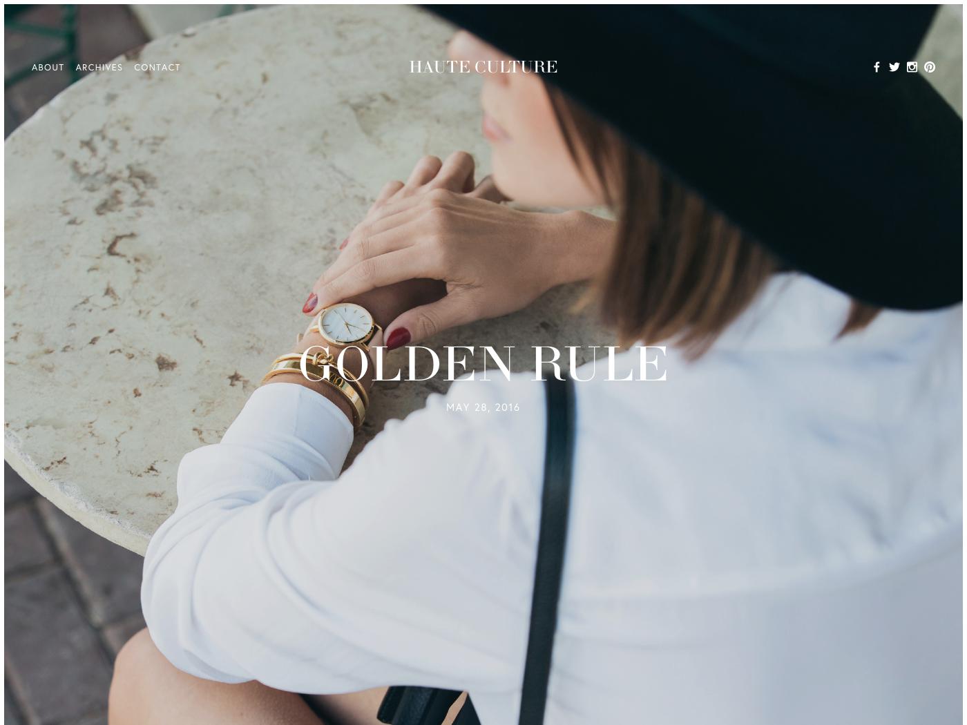
| Header | Transparent header on blog pages, opaque on all other page types. 3 areas within the header: left, right and center. Choose to show header, main nav, secondary nav social icons and/or shopping cart in any of the 3 locations. Can style the shopping cart as bag, text or cart. |
| Header Images (Banners) | Only on blog posts, and there you can choose either wide or narrow (not full-width). No banners on any other page types. |
| Site Tag Line | Yes, can choose to display in any of the 3 header areas. |
| Main Navigation | Horizontal nav at the top, with many style settings. Secondary nav at the top can inherit style settings. Can also choose to display icons if desired. Can apply a wide range of style edits to the mobile nav, too. |
| Fixed Navbar? | NO, except on mobile if you have shopping cart enabled (it sticks at the bottom). |
| Other Navigation | Secondary nav header, another nav in footer, appearing above other footer content. |
| Social Icons | Top header right, left, center or hidden. Can set size, style and color. |
| Footer | Normal, with large padding and a pale horizontal divider line at the top. |
| Page Titles & Descriptions | NO |
| Gallery Design | Grid or slideshow, with adjustable style settings for each. |
| Gallery Display | Image title and descriptions appear as overlay. |
| Thumbnail image shown in blog Excerpt? | YES, can set aspect ratio, and even set custom styles like black & white or tinted overlays to appear on hover. |
| Location shown in blog post? | YES, if desired (can turn on/off and control position in meta) |
| Blog Notes | Blog snippets show as large or stacked grid in blog home, with many options to show which elements and how they display, including the ability to style the first post as "featured" style. Individual posts can show an Author Profile at the bottom (or not). In posts, media (images, video, map) can be set wider than text content. Post navigation as arrows on either side of the post body. A related posts block can be set to appear at the end of each post. Can set locations to appear as part of meta in any of 4 meta spaces. |
| Promoted Blocks? | NO. |
| Products Notes | Includes many features now only found on the Commerce-Boosters, such as image hover effects and image zoom. Can show category navigation within a Products Page, left, right or top. Can choose to show images as slideshow or stacked, and control many elements of the product detail page, including layout, breadcrumb and next/previous nav, colours and share buttons. |
| Other Features / Notes | Lots of style controls on newsletter blocks. |
| Basically identical to… | Haute |
Visit Squarespace and start building your site now. Or, get in touch if you’d like me to help you.


