7 websites in 6 months – and this last one’s a corker!
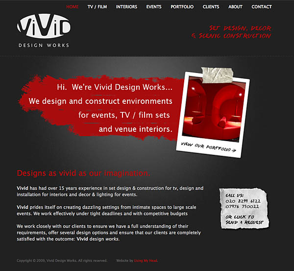
 It has been a super-busy month, and I've been whirling like a dervish. But the great news is I've just completed another Squarespace website, this time for an amazing event and set design company: Vivid Design Works. Caroline, Vivid's managing director, wanted an online showcase for their work in designing sets, interiors and events, so I was thrilled to work with such a creative company, which meant I would get to exercise some real creativity in the design. The web design needed to be understated yet bold - if you can have such a thing - to reflect the company spirit of vivacity, but still allow the images of their work to stand out.
The winning concept was to have the website designed as though you were looking down at one of the Vivid designers' desks, with some of the elements they might have there: scraps of paper, a sketchbook, masking tape, slides and photos from a mood board. I really like the end result, and feel the dark grey sets off the client images nicely, with the red accents adding the right amount of Vivid punch. Have a look for yourself and let me know what you think :-)
This is my 7th Squarespace website to go live in 6 months, and I must say I am really pleased with the speed at which I can deliver polished, custom websites to my clients. I can't imagine having been able to deliver this quantity - and quality - of sites with all the features in the same amount of time using any other system. So far, all clients have fallen in love with the ease at which they can edit their websites, and we are both impressed with the sophistication and broad feature set that you get, for around the same price as regular web hosting that comes without a CMS.
Naturally, there are some limitations and things that Squarespace could do better... if I can find time to breathe I will try to summarise them in another post. But overall, I am pleased as punch - and in fact I've got to get back to work on yet another Squarespace site due to launch next week. Whew!
