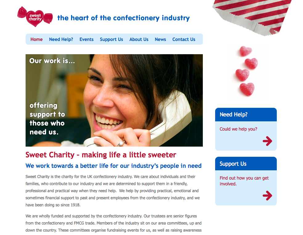
A sweet new site for charity
 Today marks the launch of my latest Squarespace website: a charity website for the Confectioner's Benevolvent Fund (aka Sweet Charity). As they are a small UK charity, the challenge on this project was to create a great looking and functioning site on a tight budget, complete with multiple author/editor roles, embedded Flash and an event calendar. The fun part was using their brand name and industry in a creative way to form part of the design. The result of this is the bag of sweets that pours onto the pages, with different types and formations of sweets representing the different page contents conceptually. The client loves the concept so much that they will be using it on their offline marketing material, which makes us both happy.
We'll be working together in 2010 incorporating the new look into their e-mail newsletters, and I will also be advising them on how they can use some of the latest gen online tools and web apps to streamline their internal workflow, allowing staff more time to focus on the important things: fundraising and helping people who need their assistance. It's within organisations like Sweet Charity that I feel these web apps stand to make the biggest difference: they are free or low-cost, quick to implement and learn, and they can replace manual or time-consuming activities, usually without impacting on other internal technologies. In a busy charity, there's never enough time to do things, so anything that can save time or make people's jobs easier is a godsend. And there's nothing I enjoy more than making people's work lives a little nicer.

