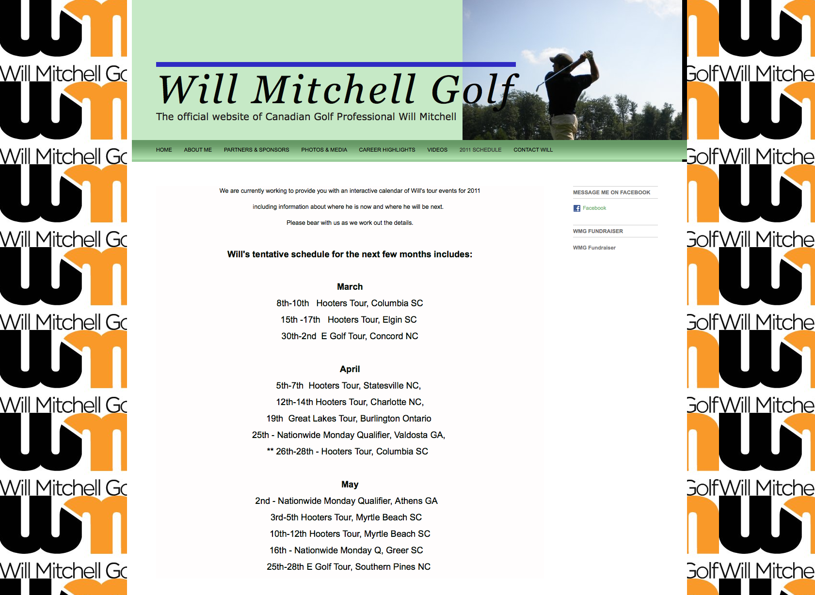
A Squarespace revamp: before & after
Squarespace is a great CMS that is really easy to use, but sometimes it takes the hand of a design pro to make it look just right. Recently I was contacted through my Squarespace microsite by a client who had been using Squarespace for a while, but needed some help in making the site look more professional. The client is a professional golfer from Canada, so he needed something that reflected a more polished image, but didn't cost the earth - every sponsor/fundraising dollar counts when you're a young pro. Squarespace is perfect for this, as I can turn out a polished design very quickly and easily, keeping the costs down. He also needed to be able to update his blog while on tour, without having to log in and think too much about the technology. Once again, Squarespace already has an 'email-to-blog' function built in, so all we needed to do was turn it on, and he was able to create blog posts just by sending an email to a special email address. Squarespace automatically turns those emails into posts. Easy as pie, and it means he can keep his focus on the golf rather than having to fiddle with logins and whatnot.
The cool thing about the project was that the content was mostly already there, it just needed to be restructured, finessed and brought into a more user-friendly navigation. I also helped create more search-engine-friendly page titles and descriptions, so things look a lot better on Google now. And because the client was already familiar with the Squarespace system, it didn't take much training, and we were able to handle the entire project by email smoothly, across 3000 miles.
We're both really pleased with the transformation.Why not pop over to Will Mitchell Golf yourself and have a look?
If you're in a similar situation - finding it hard to make Squarespace look pretty, or stuck with a boring cookie-cutter template - drop me a line and I'd be happy to help improve your site's look and/or user-friendliness.
P.S. We also took the opportunity of working together to professionalise the way his email newsletters were being sent. He had been using PDFs attached to an Outlook email, but now he has a stylish email newsletter template which matches his site branding. He can now track email opens, clicks, and easily add new subscribers. Sweet.


