Professionalising a web app service website
One of my recent projects was to help a web-based software company to communicate about their service better online. When Festival Systems got in touch to ask if I could help improve their website, I said 'Hell, yeah!' because I could see right away that they were really great at making incredibly powerful and useful software, but not so great at communicating about it. They have one of the best products of its type on the market, but just weren't able to get the key information across to potential customers in a compelling way. I worked with them on the following areas:
- Identifying their core customer types, and teasing out the key features that would resonate with each
- Creating a marketing communication 'cheat sheet' that highlighted all the key selling points
- Developing a site structure that made it easier for people to find what they were looking for
- Crafting the user journeys that would lead to increased trial account signup
- Copywriting for all the new site pages
- Revamping the design to make it mobile-friendly and more modern
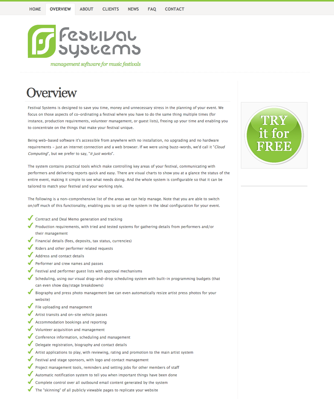
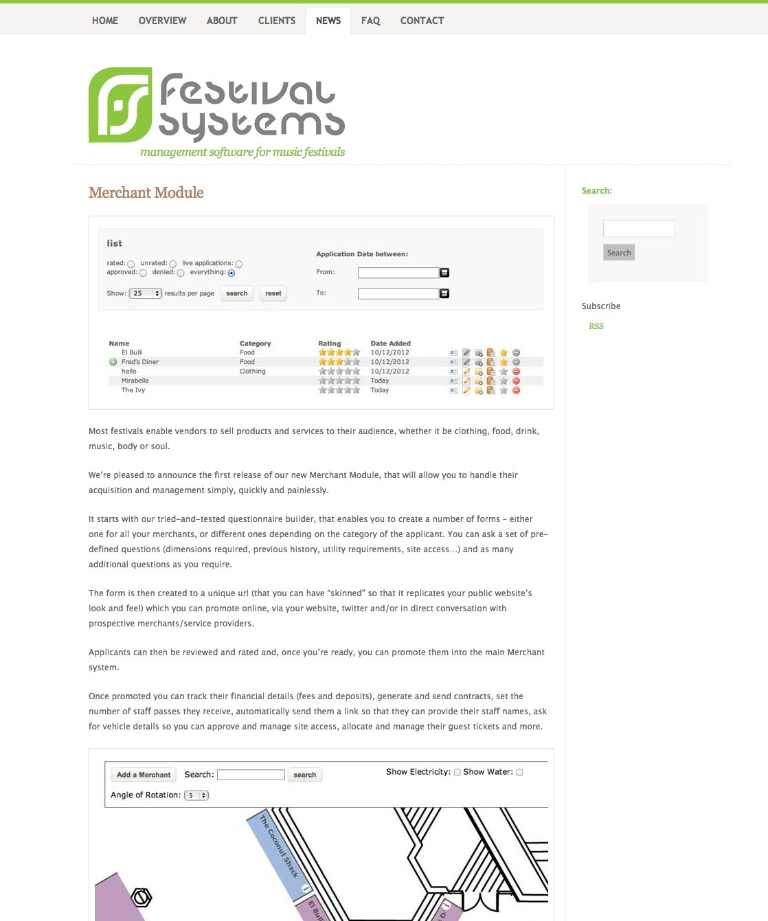
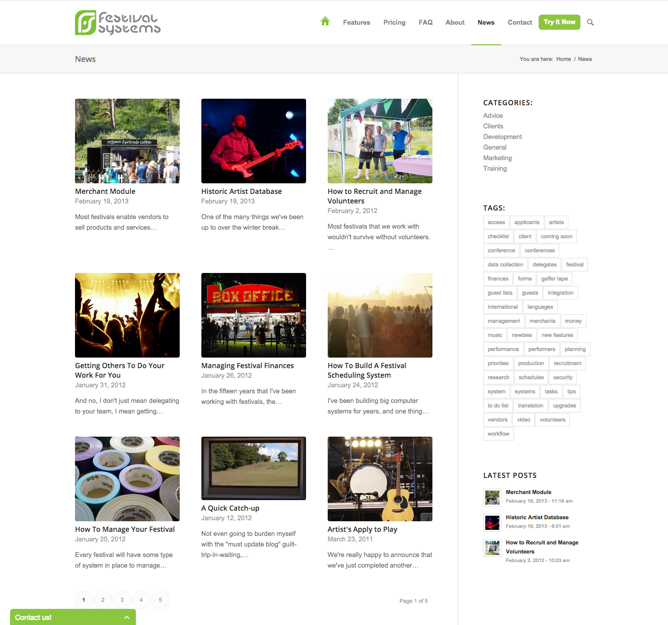
I think the results are pretty awesome, and the client is super-happy with the new site, too. Here's a little before and after, so you can see the amazing transformation for yourself: (click the thumbnails to view larger gallery)
 |
 |
 |
 |
 |
 |
If you're in the market for festival, conference or event management software, then I suggest you head over to the Festival Systems website quick! Or, stop by to have a look at the fruits of my labour. It was a fun project, and I am already keeping an eye on the Google Analytics to see the impact our work will have on the business lead generation and sales.

