Craig Reilly
About this project
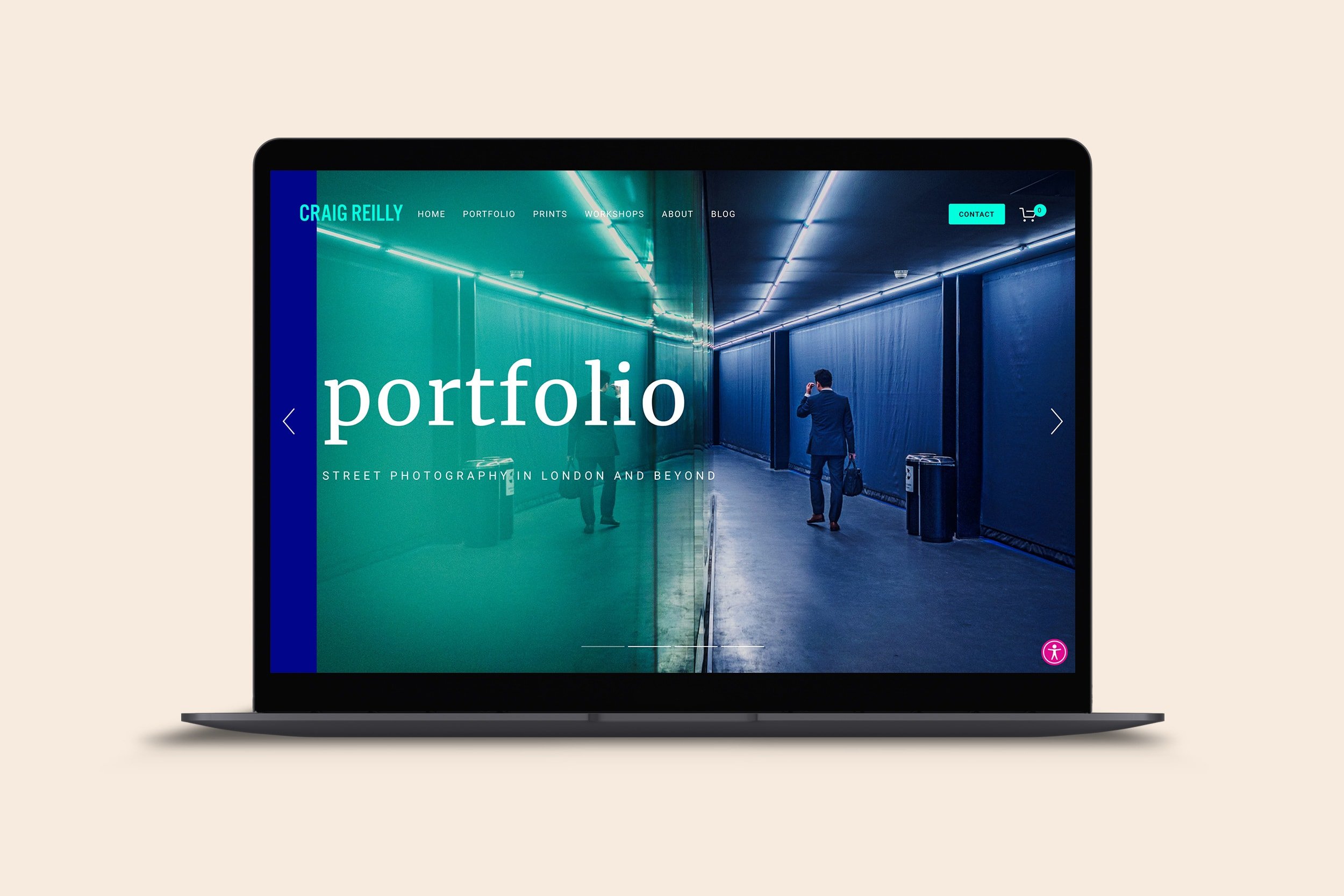
Craig had an existing Squarespace website that followed the usual formula for photographers and creatives: a minimal white website with only black or grey text, designed to play a back seat to the imagery. Craig wanted a different approach. He wanted to use strong colour to set his website apart in a crowded marketplace.
Taking the lead from his favourite portfolio images, I developed a strong colour palette that we used to identify the different sections of his website. The slideshow at the top of the homepage incorporated these colours alongside the images that inspired them. We then added large typography as a second powerful visual statement, creating a confident yet creative overall vibe.
Having recently been named as an Olympus Ambassador, Craig wanted to leverage his position to boost sales of his photography workshops, so we integrated the Acuity Scheduling booking system to allow Craig to sell tickets directly from his website. We also added a FAQ system that he could use to help reassure workshop prospects, and a blog that he could use to target SEO keywords.
As Craig was keen to make his website inclusive, we added an accessibility widget to ensure that visitors with visual impairment or neurodivergent conditions could access the content in ways that suited them.
NOTE: After project completion, all clients receive training to empower them to update their own websites, so bear in mind that anything you see on the live website may not reflect my design work.
