Elgin & Ellis
About this project
Elizabeth approached me as their manually-updated, self-built website needed a total overhaul, because like so many businesses, they had been focusing on client work rather than their website. Through our initial consultation it became clear that Elgin & Ellis was not your typical building contractor company, as they had a female director working with their clients, which their clients had fed back as one of the most positive aspects of working with them. They said it was reassuring and set them apart as having a more caring approach.
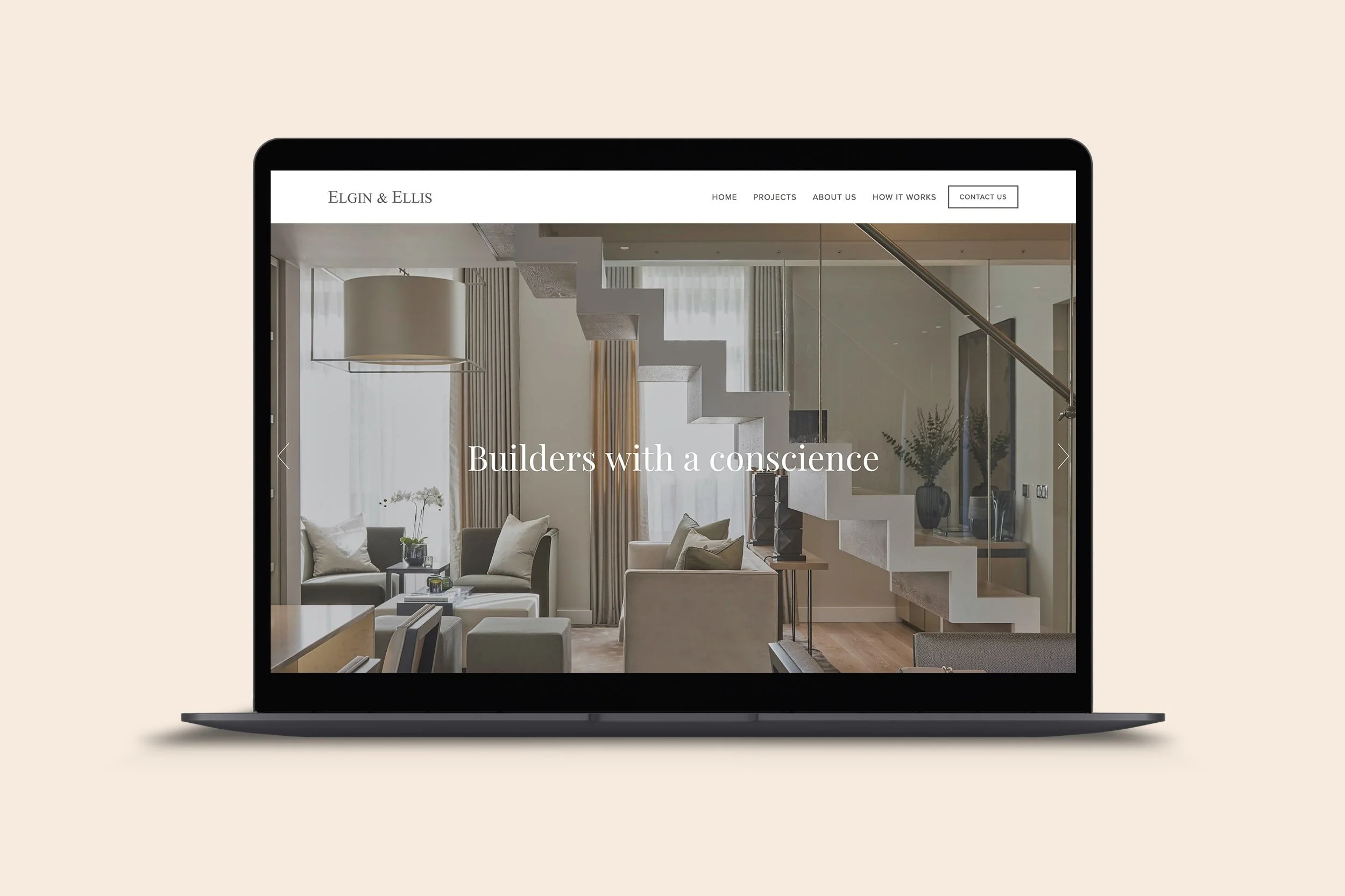
With this in mind, and the fact that most of the buying decisions were made by female clients, we targeted the more feminine touch in our choice of iconography and page layout, focusing the website content on the service-oriented nature of their work, using customer testimonials to reinforce this image.
For the portfolio, I created an editorial-style template for their project pages, again aligning the layout with something you’d expect in interiors magazines rather than the usual gallery and list of figures and square footage. This not only allowed Elizabeth and her team to easily duplicate and fill in new projects, but also set their website apart stylistically from the typical more masculine builder websites.
NOTE: After project completion, all clients receive training to empower them to update their own websites, so bear in mind that anything you see on the live website may not reflect my design work.
