Aviator Squarespace Template Analysis
Helpful notes on the distinctive features of the Aviator template family
Updated March 2018
Template Name: Aviator family
Includes: Aviator, Aubrey, and Encore (discontinued)
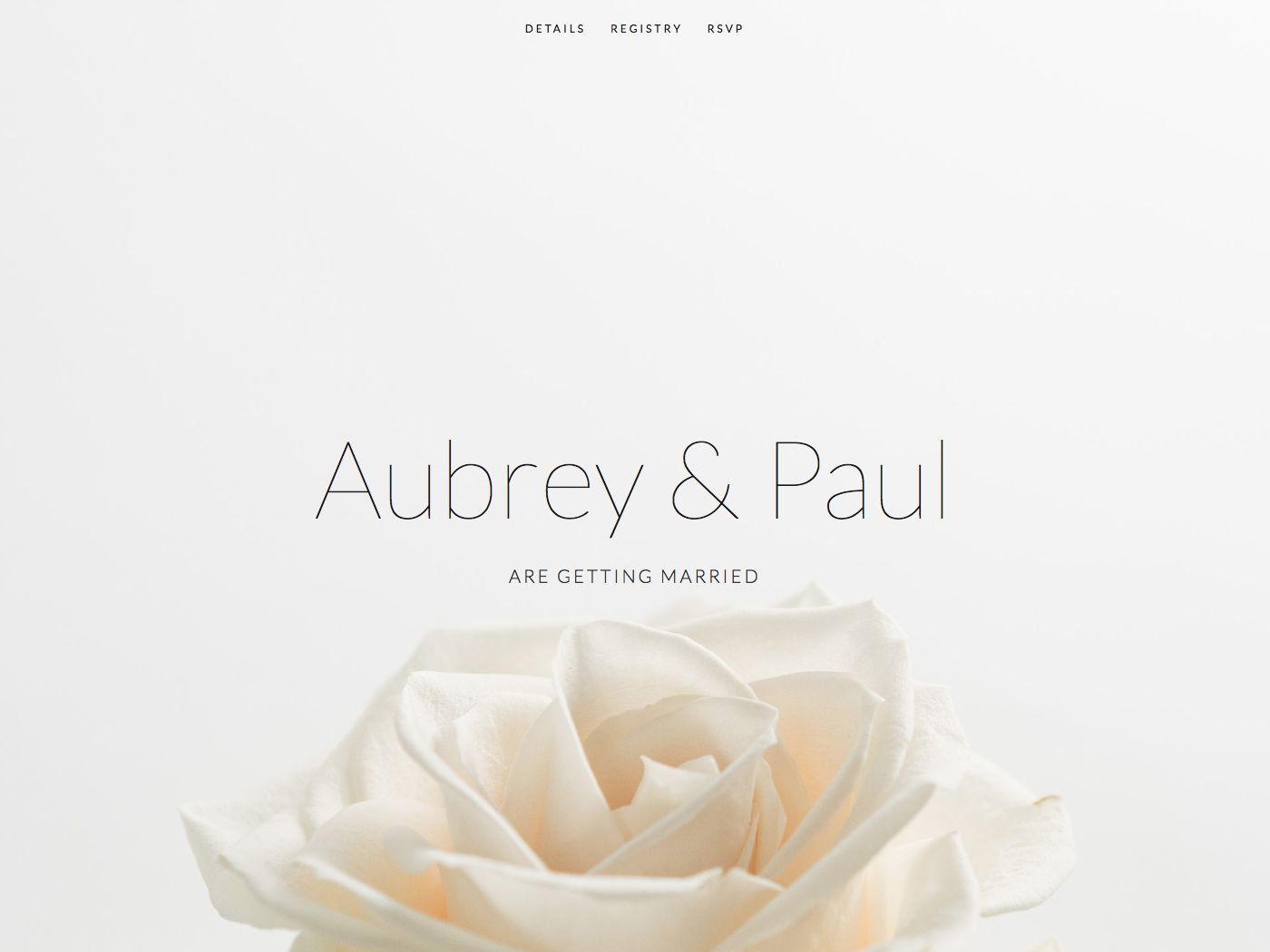
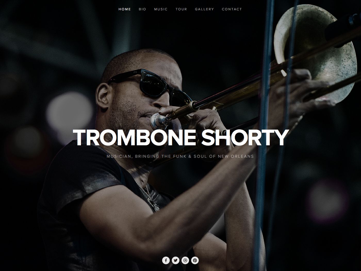
Aviator was first launched back in late 2012 as a Squarespace 6 template, and in the years that followed, proved so popular that Squarespace then developed a couple of variants of this template. The variants of Aviator are really clones, meaning that they have exactly the same set of features as the original. It seems that the main reason the variants were created was to demonstrate to customers different ways the template could be used for different types of business/website. However, several of the Aviator variants have been discontinued, so I'm wondering how much longer Aviator will stick around, especially since the main selling point of the template originally was the large full-bleed image homepage, which many other templates now offer.
Why choose Aviator?
Websites have changed a lot since 2012, especially when it comes to designing with mobiles and tablets in mind. Although the Aviator template is fully responsive (meaning it flexes to work on all sizes of device), certain things have moved on, and the newer templates have been created with everything from huge HD screens and mobiles in mind from Day 1. This means Aviator feels a little behind the times, especially in terms of the number of things you can control design-wise in the Style Editor. The newer families such as Brine offer even greater control and can achieve similar effects to Aviator's.
The only reason I can think that I'd recommend choosing Aviator today is if you want the choice between vertical and horizontal navigation, and a special homepage called an Info Page. Aviator is the only template to allow these features. Just remember that a similar effect to the special Aviator homepage can be achieved using a banner image on a template such as Brine, or through the use of a Cover Page (check out more detail on Squarespace Cover Pages here)
One final tip: be sure to read my Squarespace Template Bible for further detail on what templates do and don't control - and how to avoid the single biggest mistake people make when choosing a Squarespace template.
| Strong Point / Best For… | Bold websites that want a minimalist homepage (without the limitations of a Cover Page - for example, not having normal navigation). |
| Design Notes | Fullscreen background image that stays fixed, with content floating on top in a narrow column in the middle. On long pages, the content column scrolls while the background is stationary. Medium style controls. |
| Homepage | Special "Info Page": floating block that can be positioned bottom left or center. This block can have the logo and site tagline, or a block of "Freeform Text" - a Squarespace Text Block that can be formatted. This means you can simulate a Squarespace Cover page (splash page) and have a slightly different layout for your homepage than the rest of the site. |
| Index Page | NO |
| Sidebars | NONE |
| Header | Minimalist text only floating navigation (left or top), with floating logo in center just above conent. Homepage "Info Page" can have logo and tagline or not. |
| Header Images (Banners) | YES - not in header, but as full-page background behind content canvas. The content can either float on top of this (a transparent canvas), or you can set a translucent or opaque background for the canvas to make the text easier to read. |
| Site Tag Line | Yes - can turn on/off and also choose to show contact info |
| Main Navigation | Can be either vertical left or horizontal top, just text floating over background image. Set the location by changing the Info Page layout (for some reason!). Folder shows + icon indicator. |
| Fixed Navbar? | YES, if vertical |
| Other Navigation | NONE |
| Social Icons | Either top right or bottom centred, depending on vertical or horiz nav selected. Can change size, color and style. |
| Footer | Normal footer, then social icons at the very bottom (if horiztonal nav selected). |
| Page Titles & Descriptions | NO |
| Gallery Design | Grid or slideshow, with adjustable style settings for each. |
| Gallery Display | Gallery shows images only: does not show page title or any contents added to page in Edit Mode. Just Gallery on its own. |
| Gallery image title display | Yes, bottom overlay on Lightbox or slideshow |
| Gallery image description display | Yes, bottom overlay on Lightbox or slideshow |
| Thumbnail image shown in blog Excerpt? | NO |
| Location shown in blog post? | NO |
| Blog Notes | Full text of blog posts show in blog home. |
| Promoted Blocks? | YES, wider than normal content column. |
| Products Notes | |
| Other Features / Notes | Border and drop shadow options on canvas. |
| Basically identical to... | Aubrey, Encore (discontinued) - these are variants of Aviator |
| Similar to… | Montauk, Wells |
Visit Squarespace and start building your site now. Or, get in touch if you’d like me to help you.


