Five Squarespace Template Analysis
Helpful notes on the distinctive features of the Five template
Updated March 2018
Template Name: Five
Five is called "Five" because it was designed when Squarespace 6 first launched, and was created in order to make it easier for Squarespace 5 customers to migrate to Squarespace 6, which was a completely rebuilt platform (almost everything changed, including the way templates worked). However, that all happened way back in 2012, which means Five is one of the oldest templates still available on Squarespace 7 today.
Why choose Five?
Websites have changed a lot since 2012, especially when it comes to designing with mobiles and tablets in mind. Although the Five template is fully responsive (meaning it flexes to work on all sizes of device), certain things have moved on, and the newer templates have been created with everything from huge HD screens and mobiles in mind from Day 1. This means Five feels a little behind the times, and while the level of control you have over the design was XL (maximum) at the time of release, the newer families such as Brine offer even greater control.
The only reason I can think that I'd recommend choosing Five today is if you want to have one or two sidebars on your website, and you want a sidebar on something other than your blog. Five is the only template to allow two sidebars, and the only one that allows sidebars on non-blog pages. Just remember that a sidebar effect can be created by using a skinny column - so don't necessarily let that limit you. Full details about the "pseudo sidebar" can be found on my blog post here: Best Squarespace template for blogging?
Lastly and most importantly, be sure to read my Squarespace Template Bible for further detail on what templates do and don't control - and how to avoid the single biggest mistake people make when choosing a Squarespace template.
| Strong Point / Best For… | Versatility and flexibility for most business types. Web designers & developers loved using Five to make sites before the newer template families came along. |
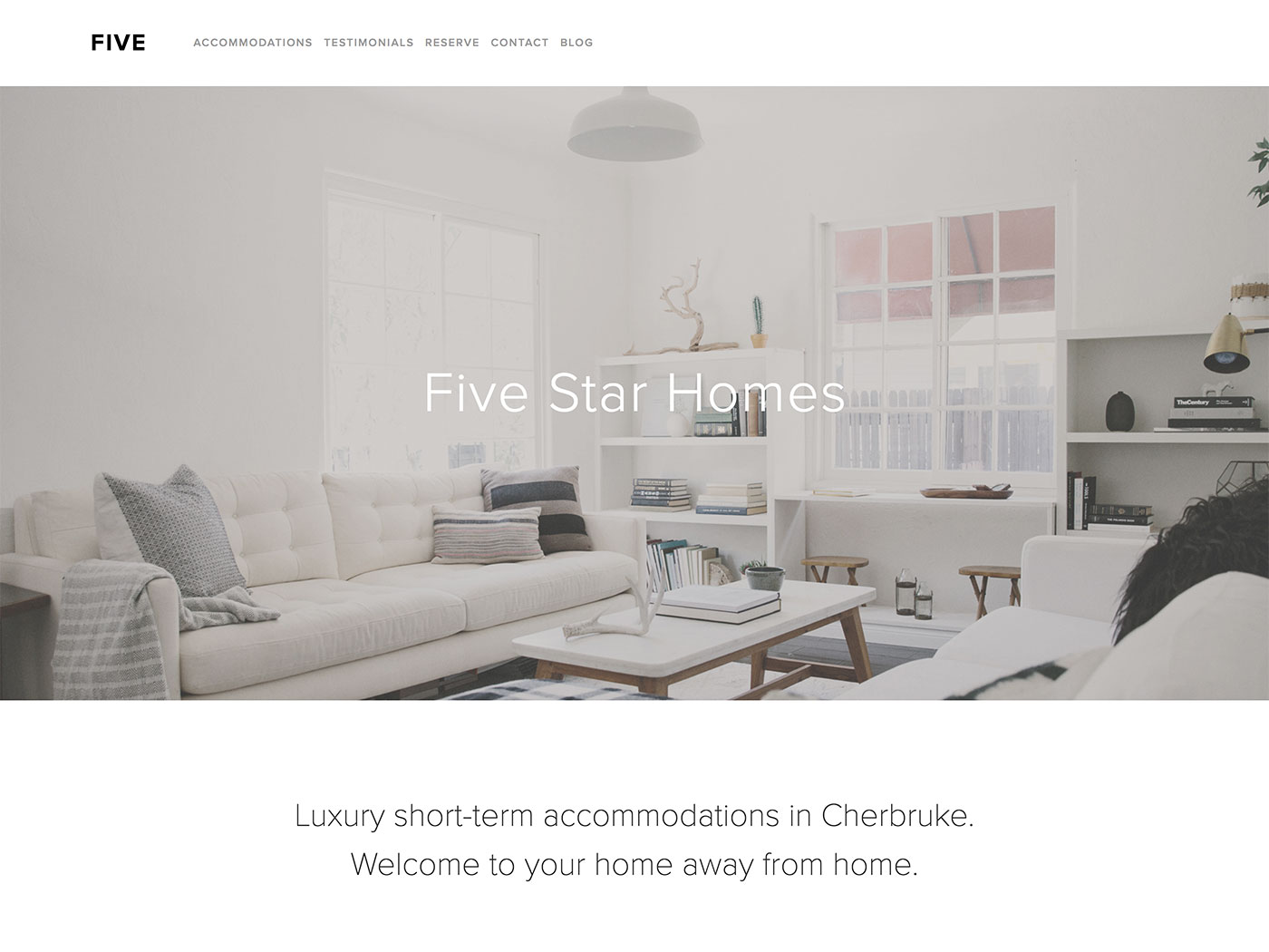
| Design Notes | Full-width canvas, with full bleed on header image, navbar and footer. Many style controls. |
| Homepage | Standard |
| Index Page | NO |
| Sidebars | Choose 1, 2 or none (full width) per page. Position left, right or split to show on both sides of body. Can be set per page. |
| Header | Full-width bleed on header. Logo (or title) and tagline can be set to float on top of header image, or you can show page title and description here instead. |
| Header Images (Banners) | YES - can set per page. Adjustable header image height. Use image, color, or no header image (just navbar). |
| Main Navigation | Horizontal of vertical: choose horizontal nav at top, above or below header. Or turn horizontal nav off to have vertical nav in sidebar. |
| Fixed Navbar? | NO |
| Other Navigation | NONE |
| Social Icons | Top nav under main items, bottom footer above items, both, or hidden. Change icon style, color and size. |
| Footer | Standard, with social icons. Footer area spans full width of page with no space around the sides. Can have top border, but background color inherits from canvas. |
| Page Titles & Descriptions | YES - optional. Can only show both, or none. They appear floating on header image. If you choose page title & description, then the site logo and tagline will not show. |
| Gallery Design | Grid or slideshow, with adjustable style settings for each. |
| Gallery Display | |
| Blog Notes | Choice of display on blog home: full post, post header & footer only, post header only. |
| Promoted Blocks? | NO |
| Products Notes | Product item page inherits thumnbail image and shows Edit Mode content from product list page. |
| Other Features / Notes | One of the few templates with the ability to have a page-specific header/footer that allows you to add content blocks to pages above/below the normal page content. This may confuse some people. Gallery template is buggy, showing info from Products page if both are In same folder. |
| Similar to… | Bryant, Alex |
Visit Squarespace and start building your site now. Or, get in touch if you’d like me to help you.

