New Squarespace Cover Page designs and how to use them
Read this before you decide to use a Cover Page on your Squarespace website
NOTE: Updated 2 January 2016 to include the latest 16 new layouts
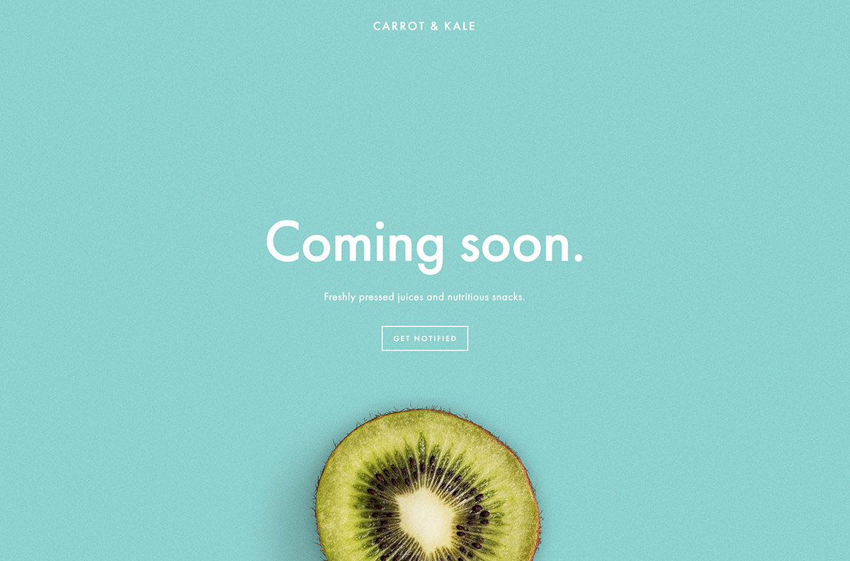
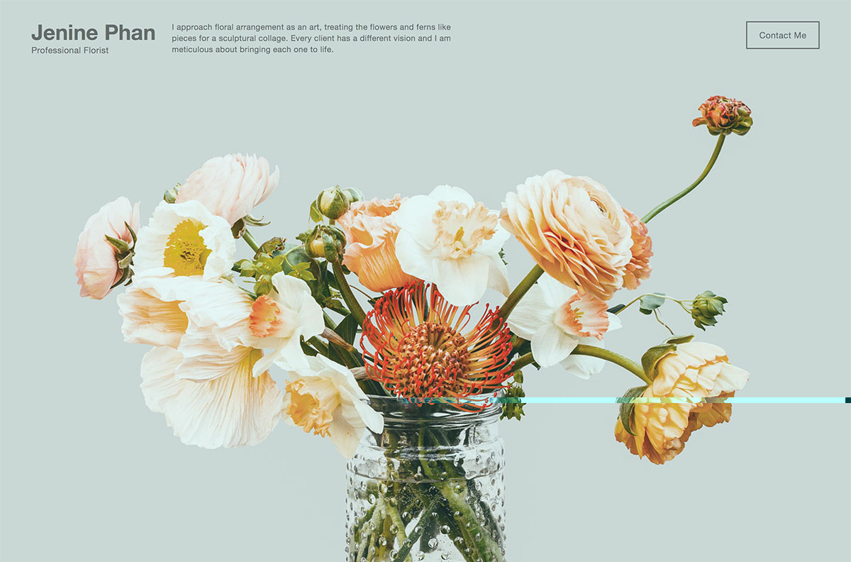
The designers at Squarespace have just updated their set of Cover Page templates*, so I thought I'd showcase the latest designs and explain how you can make use of them, as well as listing some things you may want to consider if you do decide to use one. A Squarespace Cover Page is a simple, visually-led page with a small amount of content that is most often used as Coming Soon page - a holding page that acts as a teaser before the full website launches - or as a basic online business card or flyer. However, you can actually use them for other things, too. In this post, I'll give a few ideas to help you understand their potential, as well as explaining the pros and cons that come with Squarespace Cover Pages.
* Squarespace calls the design templates for Cover Pages 'layouts' in order to stop confusion with Squarespace site templates. I'll adopt the same approach here...
Until recently, there were just a handful of designs to choose from, but now Squarespace has expanded the set to a total of 28 layouts, which you can see at the end of this post. Jump to Cover Page Gallery
You can tell from the demos and categories that they are designed for certain purposes: showing location, showcasing video, previewing an album or other audio, or just making a bold visual statement. You can actually use any of the layouts for making a bold visual statement - for example, you could use the Record layout but not include any audio files. Likewise, you could use Premier but not have a video and associated 'play' button. However, if you need to have audio, video or maps, then you will be limited to the layouts that support those types of content (you can filter using the drop-down menu within the Squarespace interface).
UPDATE: I have recently made a comparison chart for all the Cover Page layouts
Cover Page design is separate from the rest of your website's design
One of the quirks that comes with Cover Pages is that the design is controlled completely independently from the rest of your site's design. This can be a blessing and a curse. The major benefit of setting fonts, logos, colours, and everything else aesthetic in a different place from the main site template is that it means you can easily and safely switch templates or change certain element styles within a template without affecting the Cover Page. This is why they are perfect for Coming Soon pages - you can tinker away in the background without worry. However, should you decide to incorporate a Cover Page into a normal full website, it does mean that you have to set everything twice... and if you later update your website's logo, fonts or colours, you mustn't forget to mirror that change on your Cover Page, too. Alternately, you can take advantage of this ability to have different fonts, colours, etc should you want to create a unique look for a certain part of your website (see Section intros or Staff/personal profiles below, for example).
Cover Pages can have a limited number of buttons or navigation links, and you can't use normal Content Blocks - you are limited to the fields provided within the template. There are also other restrictions: for example, your main site navigation doesn't appear on Cover Pages, and you can't choose to reposition or resize the spaces allocated to items in the page (at least not without knowing how to apply custom CSS code). It's worth noting that you can have a popup (overlay) form that's accessed from a button on the Cover Page - a nice touch, making these pages ideal as landing pages (see more detail in the ideas section below).
Using a Cover Page as a homepage: watch out for SEO & usability
Aside from the Coming Soon page, the most seemingly obvious use for a Cover Page is as a 'cover' for your site - a simple, impactful homepage that conveys a powerful visual message (in the olden days of the internet, we used to call these 'splash' pages). If you decide to use a Cover Page in this way, it's worth remembering that the limited space allocated to content in most layouts means you can only put a relatively small amount of text in the page, which could impact your ability to rank well in search engines if your industry/area is highly competitive. However, if you have deeper pages that are content-rich, regularly-updated and relevant, then this may not be a showstoppper for you. It's definitely worth bearing in mind, though - especially if you are migrating an existing site or doing a re-design, and your current homepage ranks well. Furthermore, from a usability perspective, ‘splash’ pages used as your homepage create an awkward user experience, since the navigation on this page would be different from the inner website. I therefore don’t normally recommend using a Cover Page as a homepage.
Other ways to use a Cover Page
While at first glance, it may seem like Cover Pages are pretty limited, you can actually use them for multiple purposes, not just as a homepage or holding page. Here are a few ideas:
Section intros
If your website has multiple different topics or sections that you want to clearly distinguish from one another, layouts such as Spotlight or Reveal could be used as intro pages to each section, allowing you to use strong visuals to give each section a clear identity. You can then use the built-in navigation or buttons to lead to pages deeper in that section.
Design portfolio showcase
Designers, photographers or artisans may find full-bleed layouts such as Portrait or Debut to be a powerful way to show off their work. Cover Pages allow you to have multiple full-screen images as backgrounds, and they appear as an auto-playing slideshow. Or, you could use Cover Pages as a lead-in page to different themes or sections of your portfolio.
Because you can use these full-bleed slideshow (or static image) pages with any Squarespace template, suddenly your choices of template for your website are much wider than before. In the past, many photographers had to use site templates such as Forte, Encore or Shift to be able to use full-screen images, but now the whole set of Squarespace templates is available to use for your website. Just use a Cover Page for the full-screen pages instead.
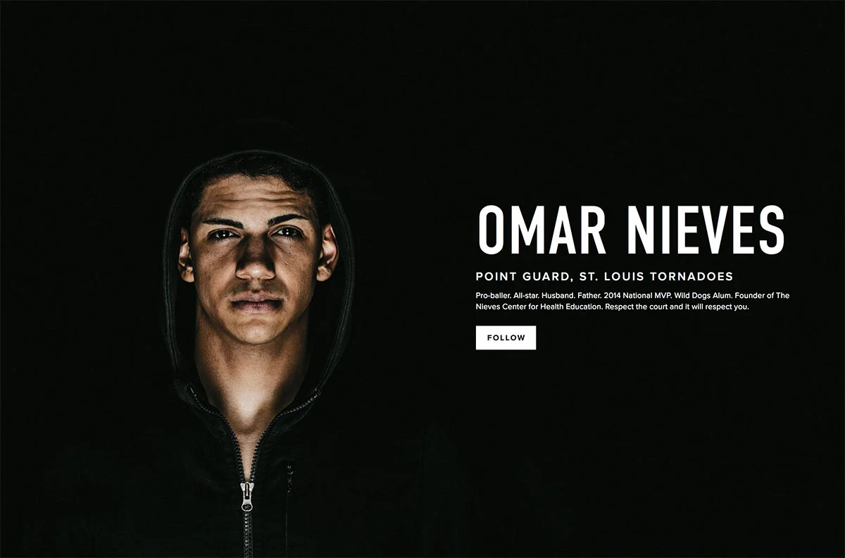
Example of Cover Page as profile
Staff / personal profiles
The Focus or Spotlight layout can work well as a personal profile page. These profiles might be linked from an About Us or Our Staff page, allowing visitors to learn more about you. The ability to personalise the background colour or font per person means that each person's page can have a distinct, more personalised feeling.
White Papers, press releases or other long-form text (with downloads)
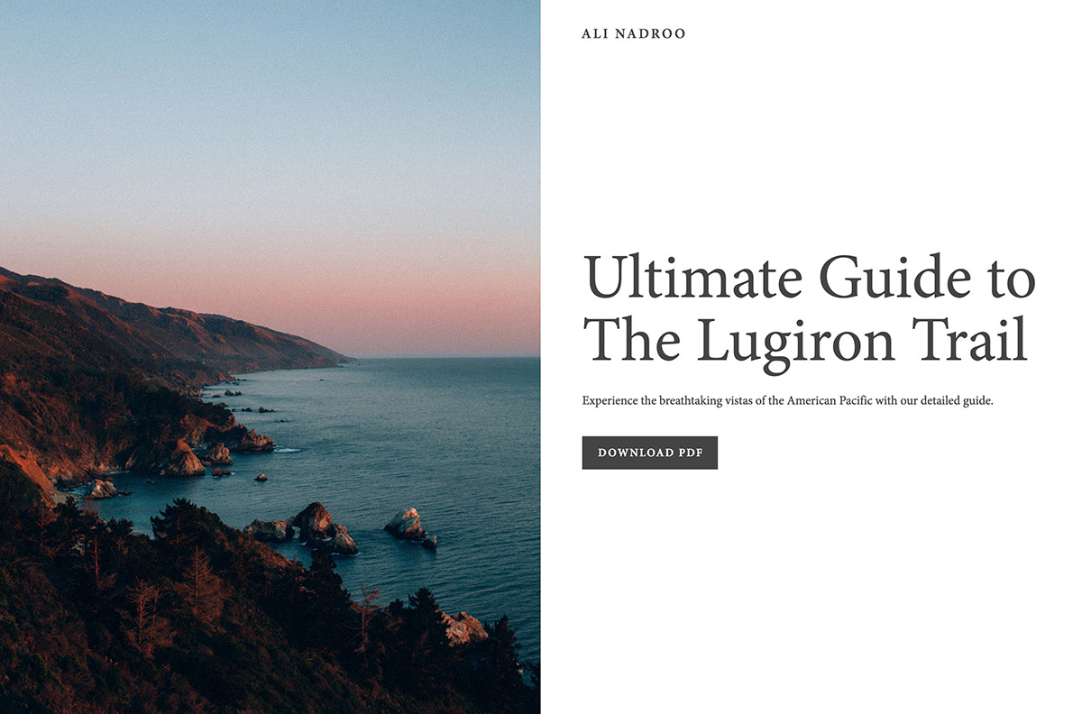
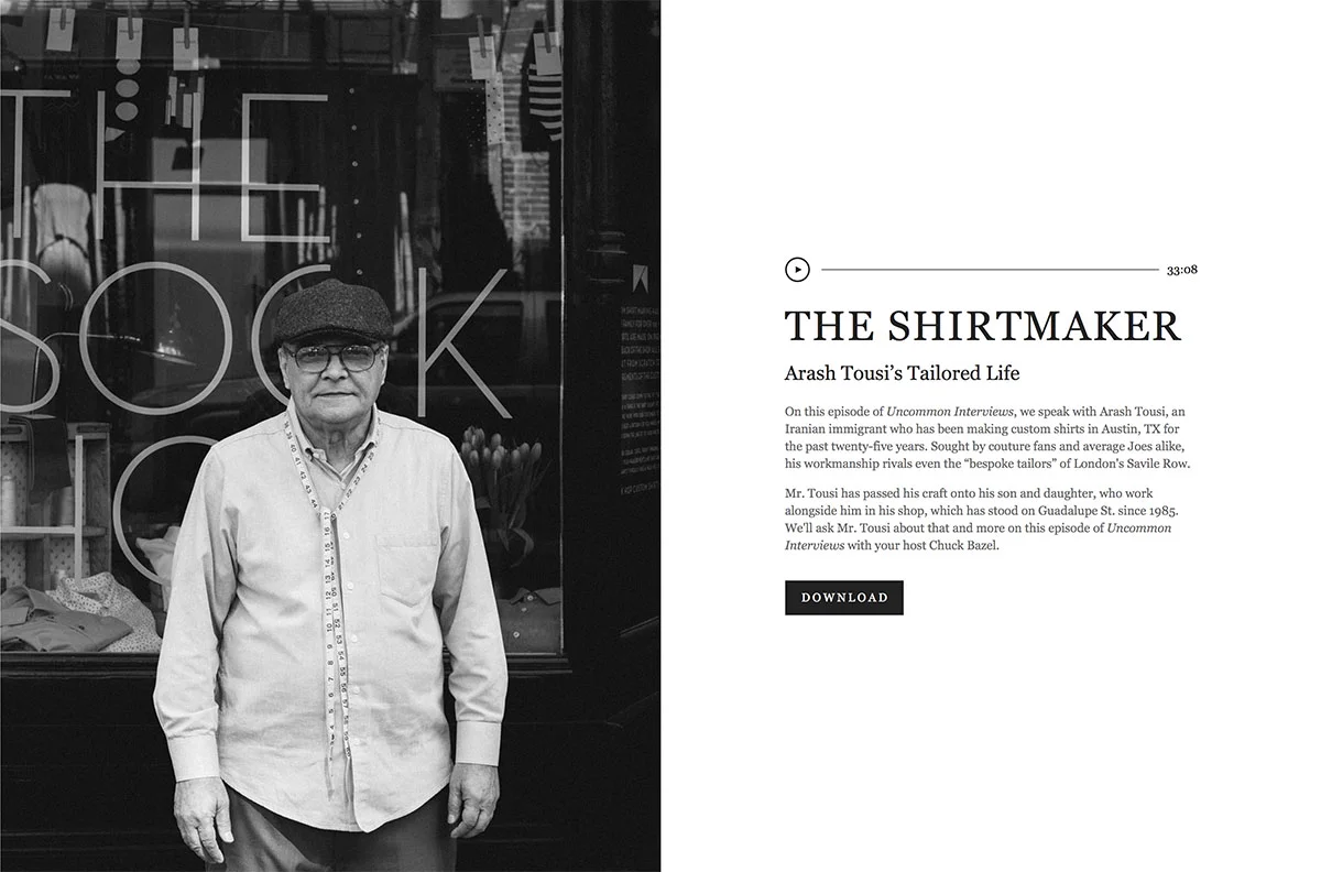
The Backstory layout is perfect for showcasing any kind of long-form article that you want people to download - use the button as a link to your downloadable PDF. The text area can be quite long, and allows scrolling while keeping the image and buttons static and visible at all times.
Email, event or other campaign landing pages
All of the above methods are ways you can use Cover Pages within your main website. However, the final - and possibly most powerful - way to use Cover Pages is for one-off landing pages that do not form a part of your main site's navigation. You may choose to have these pages completely isolated (not linked from your main site), or you might consider linking to them from your footer or Secondary Navigation to make them accessible to normal site visitors, not just the people whom you target in your campaign. This has the added benefit of making them visible to search engines, too.
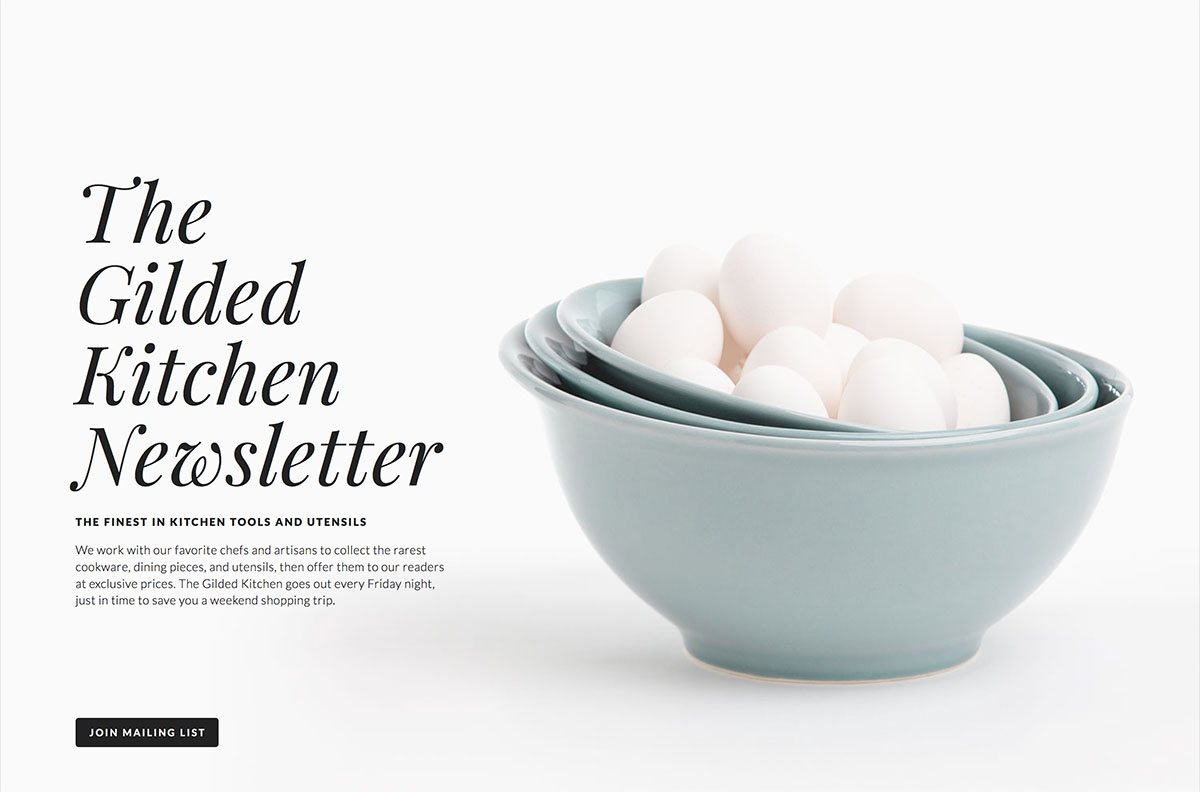
The rule of thumb for highly-converting landing pages is to remove distractions and make it easy for visitors to take the action you want them to take, which means Cover Pages can be ideal landing pages for email campaigns or other promotions. Flagship is perfect for events that you want people to RSVP for, and layouts such as Spotlight, Backstory or Record can be used as landing pages for getting more newsletter subscribers or offering a free trial of your services, for example - remember that Cover Pages can have built-in forms that you can use to capture personal details. Because Cover Pages don't include the visual clutter of your main site's navigation, footers or sidebars, they really draw the focus onto the buttons and content of this page alone.
If you do decide to use a Cover Page as a landing page, it's a good idea to also include a way back to your main website, either as a text link within the body copy or as a button.
Hopefully this article has helped inspire you to use Squarespace Cover Pages in creative ways. If you do, please let me know in the comments - I love seeing how other people make use of the Squarespace platform!
All Cover Page Layouts
Here they with demo content (click to enlarge). These are presented here according to the Squarespace category, which usually relates to the purpose of the page.
UPDATE: I have recently made a comparison chart for all the Cover Page layouts
Landing:
Profile:
Audio:
Video:
Location:


