How to format website images correctly for all devices
Uploading photos to your website the right way
Use the right file size, pixel size and format to keep your pages loading quickly and your images looking sharp.
Everyone who manages a website should understand how to correctly resize, compress and format pictures before you upload them to your website. This post will show you how.
With more and more high-resolution devices and cheap fast broadband, websites are using larger and larger images. However, at the same time, more users are accessing the web through mobile devices or in remote locations with a bad internet connection, so we must also consider the file size of our images.
I’ve been managing websites for over 20 years, I have a degree in Fine Art Photography and I worked as a professional photographer, so I'm writing this post to help anyone who puts photos onto websites find the ideal balance of image quality and file size. I'll also let you know the best number of pixels to use, and a handy tool to help you make all of this easier.
The right file type = JPG (most of the time)
This one is easy: 90% of the time, you want to be using JPEG. JPEG is the right file type to use for any type of imagery that has gradients or shading - in other words, all photographs should be saved as .JPG, as should most illustrations. The only time I ever recommend using PNG* is for illustrations or icons that have flat, solid colour - no shadows or any other type of shading - and/or if you need a transparent background. And you really want to avoid GIF unless you are using an animated GIF (and watch out for the file size if you are - GIFs can be huge!).
* Some website systems will allow the newer SVG or WEBP formats but JPG is still the most common, so these are not covered in this post.
The right dimensions / number of pixels to use
Now, you'll want to ensure your images are the right number of pixels. Too large, and the files will be massive, too small and your high-res visitors will see fuzzy pictures on their HD Retina screens.
Most website management systems such as Squarespace and WordPress automatically serve up high resolution images to HD viewers, so if your website is built in one of these, then you don't need to worry about anything other than ensuring that you always use images that are large enough (enough pixels for the space). Without getting into too much detail, I can suggest the following rules of thumb*:
FULL SCREEN: 2500* pixels wide for images that will fill the screen, such as banner images or full-screen backgrounds (also for products if you have zoom functionality enabled)
LARGE: 2000 - 2500* pixels wide for images that will fill the width of the content area (see example screenshot below)
MEDIUM: 1500* pixels wide for images that will appear up to 1/2 width of the content area

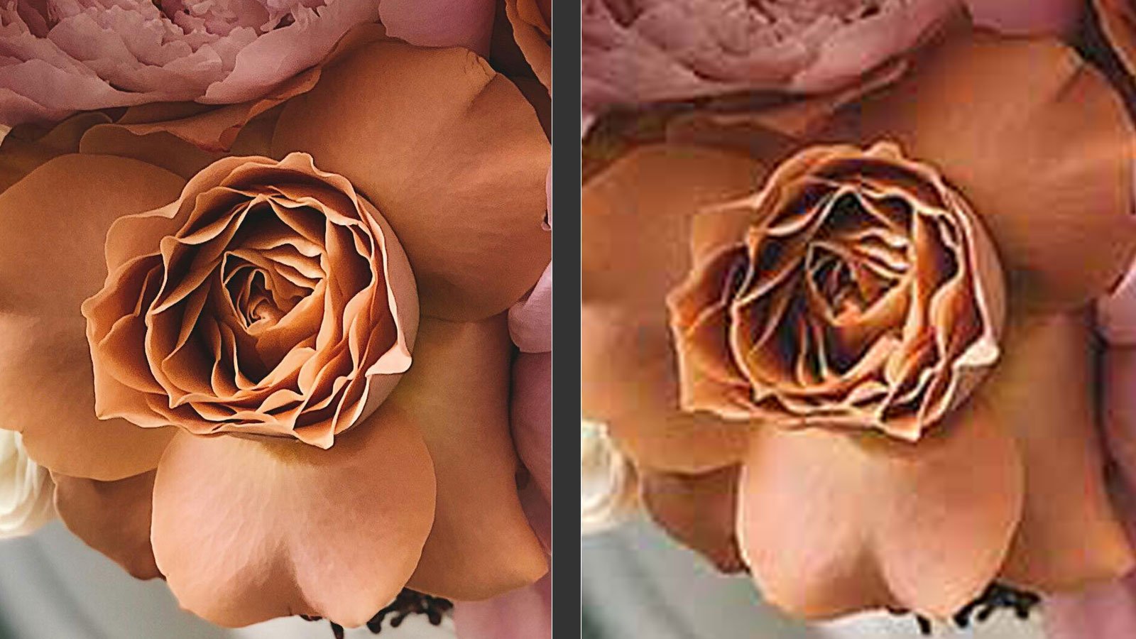
Example of what happens if an image with a small number of pixels is used in a larger space. YUCK!
If you are absolutely certain that you will never use that image for anything other than a very small portion of the screen, then you can get away with using one of the following sizes, but bear in mind this is a bit risky, especially if multiple people manage your website. There’s no way to stop someone else using an image that is too small and stretching it to fill an area that has more pixels than the original image. This results in fuzzy or pixellated images that look unprofessional.
SMALL: 1000* pixels wide for images that will only ever be shown at sizes up to 1/4 of the content area width
TINY: 750* pixels wide for images that will only ever be shown at sizes up to 1/6 of the content area width
* NOTE: These numbers correspond to the sizes that the Squarespace system creates. Squarespace creates multiple versions of the images you upload, and serves the closest corresponding size depending on where you put the image in the page, and the type of device the viewer is using. Please bear in mind that having lots of images on a page can make the page load slowly, so there may be instances when you need to step down a size to compromise load time vs image quality (see below for more detail).
The above numbers will ensure your HD visitors will have a high quality viewing experience. The 'content area' on most web sites on a computer screen is usually around 1400-1600 pixels wide as of July 2024 - though it's getting larger as HD monitors and web TVs grow. In future, this number will most certainly change.
Here's a handy screenshot example to help - the content area is the part of the main body below the top fern banner image where all of the text and images fit:
Note: Always use images with an EVEN number of pixels. Why? Because some website platforms such as Squarespace use automated software to reduce the image size based on the screen size. And if your original image is an odd number of pixels, the software calculations can mean that the size needed does not divide evenly. This can make images appear fuzzy.
The right file size = less than 1MB, ideally 500k or less
The size of your file is determined by the overall number of pixels, combined with the amount of compression that has been applied. We'll cover compression below, but as a general rule, even if you don't use compression, you never want to be uploading files larger than 1MB - and ideally, your images should be a lot smaller than that (max 500k is a good target - the smaller the better!).
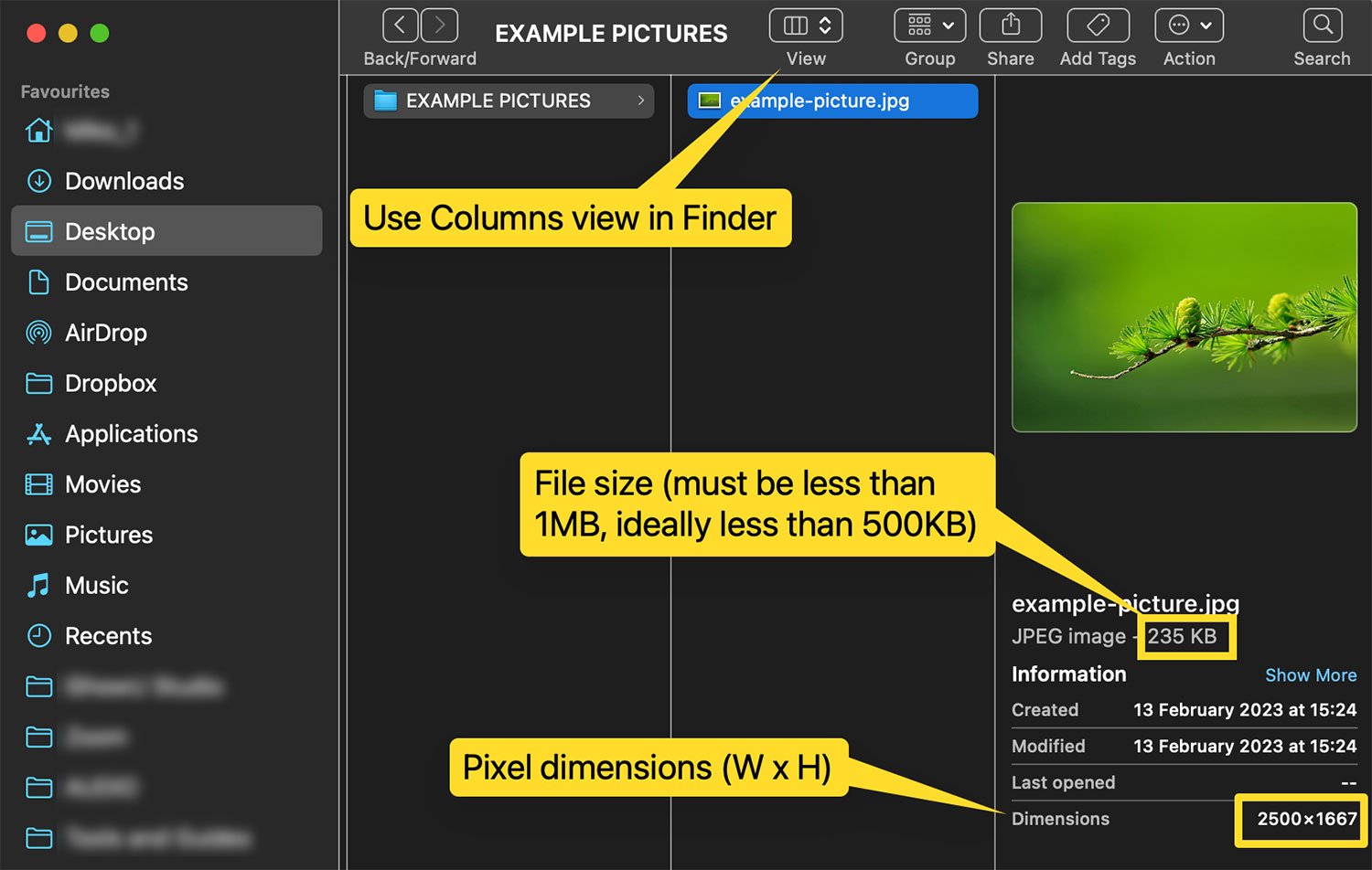
The screenshot here shows how you can see the file size and pixel dimensions on a Mac. Click here to find out how on a Windows PC >
Lots of large files/images = bad SEO / user experience
Every image you use will add to the page load time, so if you have lots of images or even just a few large images you may end up with a page that loads SLOWLY. Not only is this bad for your site visitors, but Google also uses page load speed as one of the many factors that determine your search engine rank. Don’t get super hung up on this, as it’s only one of the factors, but do be sensible and try to keep your load times as low as possible.
If your website will have gallery pages, try to keep each gallery to a maximum of 30 images if possible. And if your website uses several full-width banner images on a single page, you may need to step down to 2000 pixels wide even though it’s a banner image (which should be 2500), because it’s better to compromise a little bit on sharpness/image quality for your HD viewers than to create a slow-loading page.
The right % quality to export = 60% ish
Most of the time, if you are using stock images, free images from the great resources like pexels.com or your own images from a photographer or your camera, then your original images will be uncompressed (aka 100% quality). In order to make them web-friendly, you should compress them when you export them from your image viewing software such as Mac Preview, Photoshop, Lightroom, Windows Paint or Live Gallery - usually you do this by dragging a slider or specifying a % quality when you export. Compressing the image means to reduce the file size, but there will be a loss of quality whenever you compress. The art of compression is to minimise file size without noticeably affecting the image quality too much.
There are also specialist tools that have been created to help reduce file sizes of images. These are called image compression tools, and they normally work by reducing the file size of an image to a size that’s smaller than standard image tools can, without visibly affecting the image quality. My favourite is called ShortPixel, and I have tried A LOT of them before settling on this tool, so save yourself the headache and use ShortPixel. And I am not being paid to say that, it’s really the best tool I have found.
TIP: Use Shortpixel to compress AND resize your images at the same time
If you want to avoid having to open every single image you use, resize it and export it to compress it, then you can use Shortpixel to handle the resizing and the compression all in one step. Plus, ShortPixel’s file sizes are usually a lot smaller than manually exported compressed images, so there’s really no downside!
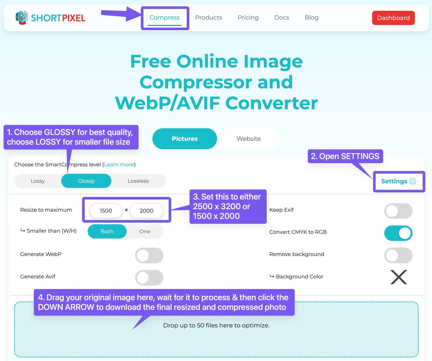
Go to Shortpixel.com and make sure you are on the Compress screen (check the top menu) then follow these steps:
Set the compression level to GLOSSY if you are a photographer, artist, or just want the best possible quality. Choose LOSSY instead if you need to keep the page load times as low as possible, and you’re willing to compromise a little on the crispness of your images.
Open the Settings panel where you will see the options for resizing (among other things). Resize is the only thing you need to worry about here.
Type into the Resize to maximum boxes:
2500 x 3200 for banner or large images, or
1500 x 2000 for images that will only ever be used up to 1/2 width of the page.Drag & drop your image(s) into the blue box and wait for ShortPixel to do its magic. Once the preview of the image finishes processing, you can click the DOWN ARROW below the little mini preview to download the image(s) one by one. If you will be doing lots of images, then you may want to consider a paid Shortpixel package, as that will allow you to drag up to 50 images at a time and download them all in one click as a ZIP file.
TOP TIP: If you will be doing a lot of images, you can remove the limits of the free version of Shortpixel by paying for a subscription or a one-time bundle. The cheapest way is to buy a one-time bundle - it's just $20 for 30,000 images and the credits never expire. I bought a bundle about 5 years ago and I have loads of images left.
BONUS TIP: The best image filenames contain your brand and keywords
Your image files are probably named something like this:
IMG_2458.jpg
If you add this to your website with this filename, you are accidentally search-engine-optimising your website for the term “IMG_2458”. That’s a wasted opportunity for SEO! You should name your files with your brand name and some keywords and/or identifier of what’s in the image, each separated by HYPHENS (not underscore, not + sign, not a space - only use a hyphen). Just don’t overdo it on the keywords, and don’t expect to rank number 1 on Google simply by changing your filenames. SE-optimised filenames are not going to rocket you to the top, but every little bit adds up. Here’s a much better name for an image file:
italy-holiday-home-kitchen-mybrand.jpg
Happy uploading!