How to make responsive vertical lines on Squarespace

Learn the right way to make vertical lines on Squarespace 7.1
The fastest and easiest way to use vertical lines in your designs, using minimal code.
If you want to use vertical lines in your Squarespace designs, but can’t find an easy and mobile-friendly approach, I’ve got a better solution for you.
Since vertical lines and split layouts are all the rage in web design recently, I’ve seen a lot of other designers sharing how to make vertical lines on Squarespace, and pretty much every one that I have seen uses either a Code Block or an Image Block. While there’s nothing inherently wrong with these approaches, I think there’s a better way. My method has the following benefits:
It is inherently responsive, which means the height of the line flexes depending on the size/shape of the device.
You’ll have 3 options for how to handle the vertical lines on mobiles: hide the line, make it horizontal, or size it as you wish in the editor.
Paste 1 bit of CSS code and never have to look at code again.
It’s much faster than having to manually edit anything whenever you want to add a new line somewhere.
You can add and resize my special blocks the same way you add or resize any Squarespace block.
You can use it even if you are on the cheapest Squarespace subscription, since there’s no need for code injections.
BONUS: You can set the lines to automatically match whatever colour you are using for normal horizontal line blocks.
I’m sold - skip the background info & video - jump to the instructions please ↓
Why Code Blocks and Image Blocks are not a good way to make vertical lines in Squarespace
Nobody wants to have to manually edit code for every single vertical line on their website.
If you use the Code Block method, you are going to have to manually copy/paste code into a new Code Block every time you want to add a vertical line to the page. And if you want your lines to be different lengths, then you are going to have to do some math and then work out which bit of the code you need to edit to make the new line shorter/longer. If you’re not familiar with code, this can be scary… because if you accidentally delete a semicolon or something in the code, you might break the page. Eeek!
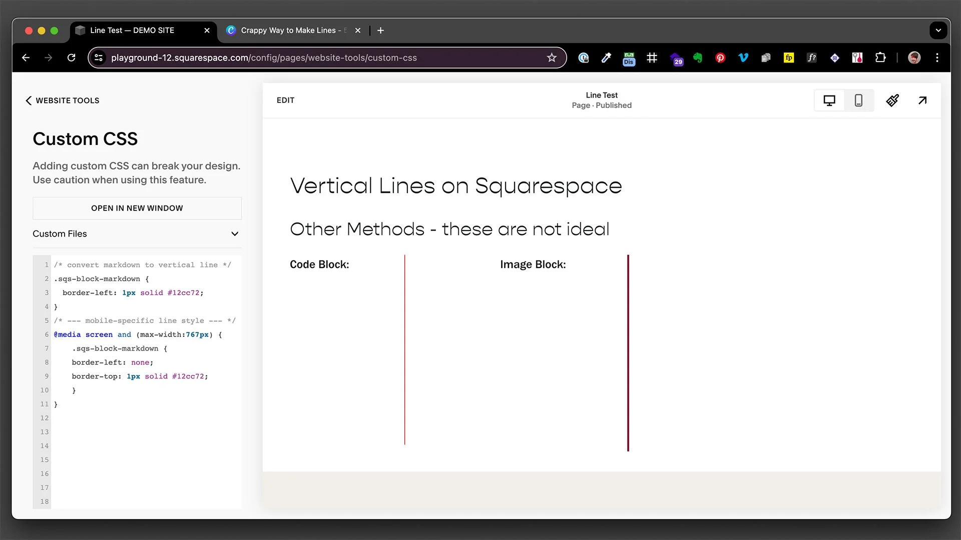
Nobody wants to have to create a new image file for every different vertical line on their website.
The Image Block method means you have to make an image file that is the exact dimensions you want to use - and this isn’t always as easy as it seems, since Image Blocks will snap to fit the design ‘grid’ in the Squarespace editor. Even if you do get it right, if you want to have a line block of a different length, then you are going to have to go back into Canva, Photoshop or whatever you used to make the first line to create another image file that’s the height you want… for every single line that’s a different length. You can’t even stretch the image in Squarespace - see the video below to see why. Furthermore, you should really be setting alt text for every image on your website to ensure a better user experience for visually impaired people, which makes a belaboured process even longer. Come on, people have cat videos to watch on TikTok - ain’t nobody got time for this!
The Code Block and Image Block methods are not ideal for mobile users.
Since both the Code Block and Image Block methods stay vertical even on a mobile device, these lines often end up creating an undesirable effect on mobiles, either forcing the user to scroll unnecessarily, or sitting in an unbalanced position, possibly squishing up valuable text content. It’s a much better idea to handle the lines differently on mobile, by either hiding them or switching them to a horizontal line to take up less screen space.
Both Code Block and Image Block methods add to page load time if you use a lot of lines.
Every bit of extra code or having lots of image files on a page can add up and contribute to a longer page load time - especially if your pages are long and/or you have lots of vertical lines in use on the page. Now, I’m not saying that this is going to be bad enough to get your site penalised on Google, but slow pages are generally bad for SEO - and more importantly, for usability, particularly if your site visitors are using older devices on a slow internet connection. Why not do everything you can to keep your page speed as quick as possible?
Video: Comparing different methods & showing my method to use vertical lines in Squarespace designs
If you’re a visual learner or you’d like to see what I mean by the above limitations - as well as seeing exactly how I make vertical lines, how to resize them and more, I have made a handy video for you. Be sure to check the instructions below the video for the code that you can copy/paste into your Squarespace website’s Custom CSS.
Instructions on how to use Markdown Blocks to make vertical lines in Squarespace
If I’ve managed to convince you there’s a better way, here are my steps and the custom code that you can use freely on your own Squarespace website. My method uses an empty Markdown Block with a border applied to it, so if you are already using Markdown Blocks for other reasons on your website, then you will need to swap out the code below - see the Modifications & Tweaks section at the bottom of this page. And if you want to get super fancy, there are also some cool tips in the Modifications & Tweaks section that will show you things like how to use colours from your Site Styles to have different coloured lines to match the dividers in your website Color Themes. Pretty awesome, eh?
Copy this code & paste into Website Tools > Custom CSS:
/* convert markdown to vertical line */
.sqs-block-markdown {
border-left: 1px solid green;
}
/* --- mobile-specific line style --- */
@media screen and (max-width:767px) {
.sqs-block-markdown {
border-left: none;
border-top: 1px solid green;
}
}
How to adjust: Replace the word 'green' with your preferred colour name, HEX code or RGB colour code. There are 2 places you need to make this change in the code: the top bit AND the mobile-specific bit. You can change the thickness by adjusting the number (in both places) from 1px to whatever pixel width you want (eg. 3px). And check the Modifications & Tweaks section below to learn how to make the colour adapt according to your Site Styles.
In case you didn’t watch the video: bear in mind that the above code converts vertical lines to horizontal lines on mobiles. If you don’t want this to happen, simply omit everything after this first } symbol - don’t include the mobile-specific line style. If you prefer to hide the lines entirely on a mobile, you can simply remove the following line from the mobile-specific line style code:
border-top: 1px solid green;
(Watch the video above if this doesn’t make sense to you)
Modifications & Tweaks
There are some limitations to the above method, but nothing that can’t be worked around with some minor adjustments to the code and/or where you paste it. Check out the video to see what I mean. In the video, I cover:
How to set it so the colour inherits from Site Styles
How to apply the code to one page only (or set different colours on that page)
How to set or remove the line on a single block
Version of the code to use if you want the vertical line colour to be inherited by the colour you set for horizontal lines in the Site Styles > Color Themes:
/* convert markdown to vertical line */
.sqs-block-markdown {
border-left: 1px solid var(--tweak-line-block-line-color);
}
/* -- mobile-specific line style -- */
@media screen and (max-width:767px) {
.sqs-block-markdown {
border-left: none;
border-top: 1px solid var(--tweak-line-block-line-color);
}
}
Version of the code to use if you want to change the colours or thickness on a page-by-page basis - Copy/Paste this into the Page Settings > Code Injection:
<style>
/* --- set vertical line style --- */
.sqs-block-markdown {
border-left: 1px solid green;
}
/* --- mobile-specific line style --- */
@media screen and (max-width:767px) {
.sqs-block-markdown {
border-left: none;
border-top: 1px solid green;
}
}
</style>
IMPORTANT: You need to be on the Business level Squarespace plan or higher to use Code Injections. There is a way around this, though. Leave me a comment below if you want me to update this page with the workaround for that.
Version of the code to use if you want to change or set the colours or thickness on an individual block:
/* --- set vertical line --- */
#block-aebe11e605c9c8f97783 {
border-left: 1px solid red;
}
/* --- mobile-specific line style --- */
@media screen and (max-width:767px) {
#block-aebe11e605c9c8f97783 {
border-left: none;
border-top: 1px solid red;
}
}
How to use: Replace the #block ID number with your block's ID number. You will need to use the Squarespace ID Finder browser extension or inspect the code to find your ID number.
Version of the code to use if you are using Markdown blocks for other purposes on your website, and you don’t want those blocks to have the vertical line applied to them:
/* --- hide vertical line --- */
#block-aebe11e605c9c8f97783 {
border-left: none !important;
}
How to use: Replace the #block ID number with the ID number of the block you want to hide the line on. You will need to use the Squarespace ID Finder browser extension or inspect the code to find your ID number.
Frequently Asked Questions
-
Unfortunately not, since it's not possible to adjust the height of Markdown blocks in that older version of Squarespace.
-
You can use the code on any level Squarespace subscription plan, except the page-specific version in the Modifications & Tweaks. However, you can actually do things on a page-by-page basis without needing to use a Page Setting Code Injection. Leave me a comment below if you need to learn how to do that and I will provide instructions for that, too.
-
You can use the code in combination. Simply set the main colours/styles in the Website Tools > Custom CSS and then you can override whatever styles you have set there by either applying the page-by-page method or by applying the individual block method. If you are using the individual block method, just make sure you paste the individual block code BELOW the main site code in the Custom CSS box.
-
Leave your question in the comments below and I will do my best to respond with updated code and/or answers :-)